Last time, I showed you a little about how I posed my characters for their shaze battle. But my cover is meant to be more than just A'mara... this is a book about the Neví as well.
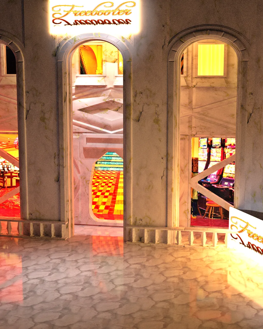
So, I decided to feature the Freebooter Casino that the Neví are building in Joton, Kri'enden - actually in the above story, it is nearly ready to open... so, that's what I've built.
(Storywise, we’ve already visited it – or maybe an extension of it – in **Sands of Survival – and I already know when/how it will end a number of years in the future… but in 830 T.C.E., it is poised to become it’s flagship casino…)
Anyway... Once again, I turned to DAZ 3D Studio.
This is the most elaborate set I’ve put together to date – comprising of 24 separate pieces, not including the lights and camera.
Positioning
I began with the floor, door, wall and windows pieces put out by DNA (a user on Renderosity and/or CG Trader.) These pieces were rather futuristic – like an “outpost” setting with lots of metal and rust. Over the past few months, however, I’ve learned just how easy it is to alter the texture of set pieces, so I wasn’t at all worried about the fact that they looked terrible (in the light of making a brand new, fancy casino, anyway.)
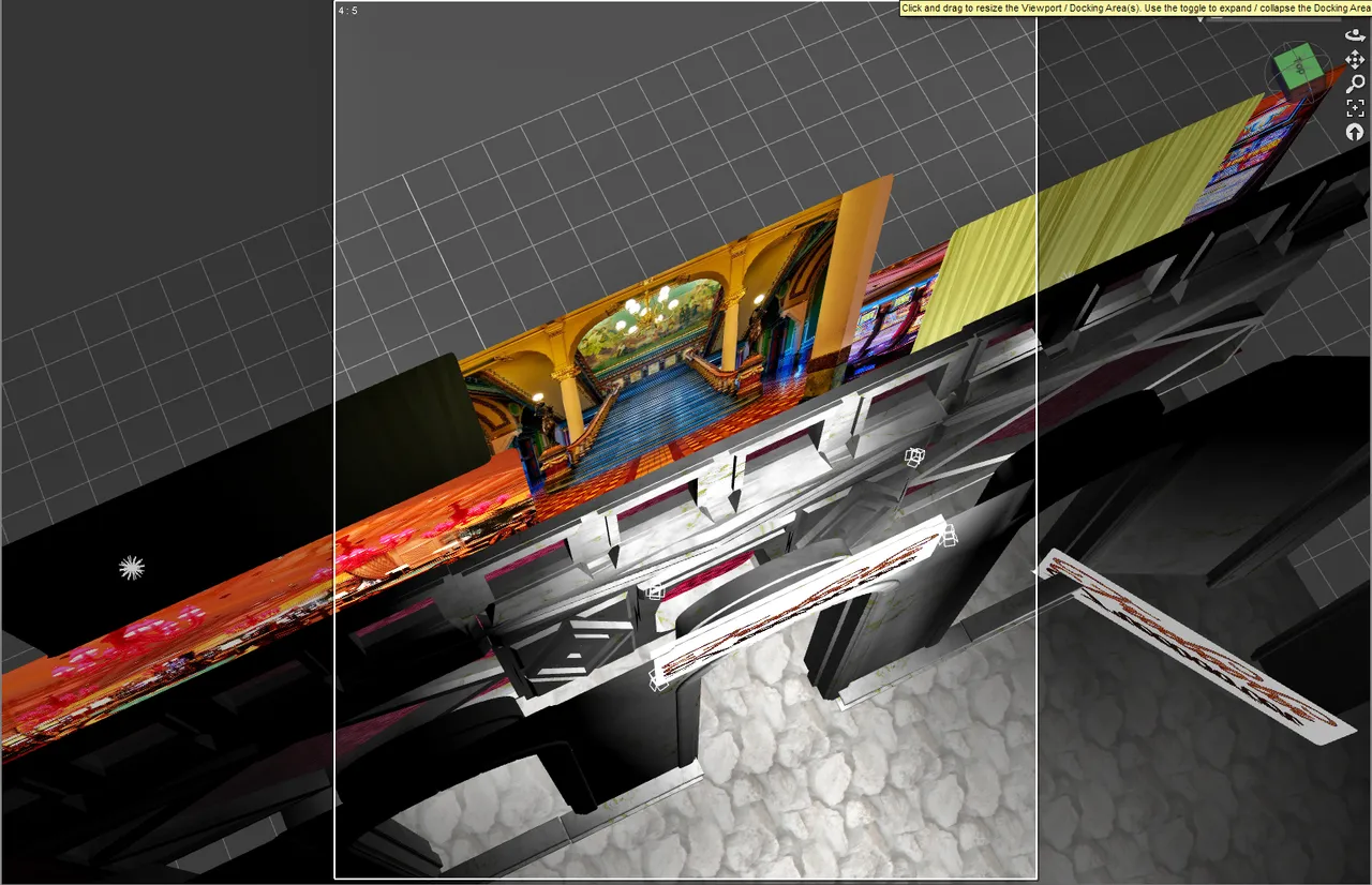
This image shows almost all 24 pieces. The front section is a large monstrosity with 5 balcony pieces and two backdrops.
The middle is 9 separate pieces. (DNA platez)
The back is 5 different backdrops. (freebie somewhere)
The front has 1 big piece from DAZ alchemy, 5 balcony pieces from DAZ alkanaro, and 2 more backdrops.
The floor has two separate pieces as well. (DNA platez)
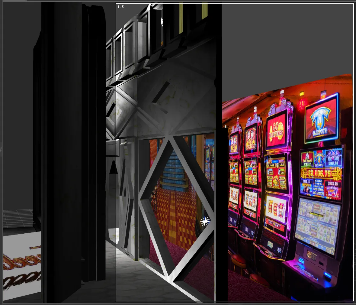
From the side, you get a better view of what's going on in the middle wall. Three levels - the bottom level has display windows and a door. The middle level is just blank walls. Above are windows to guest rooms. Obviously, one is occupied right now, the other is not - or they're asleep.
Texturing
The original pieces for the structure of the casino were for an "outpost" sci-fi type of scene complete with metal and rust. The largest piece here (the arches) was in a gothic style. Neither were really suitable for a shiny brand new, posh casino where opulence is the name of the game.
I found this lovely piece of marble on Pixabay. I took that to Gimp and replaced some of the dark veins with gold.
That texture went on every main surface of the building.
The ground was a [stone texture from PxHere which I took to Gimp and white-washed to be more consistent with the marble.
I needed a carpet for the interior of the casino. That one, I found at PublicDomainPictures.
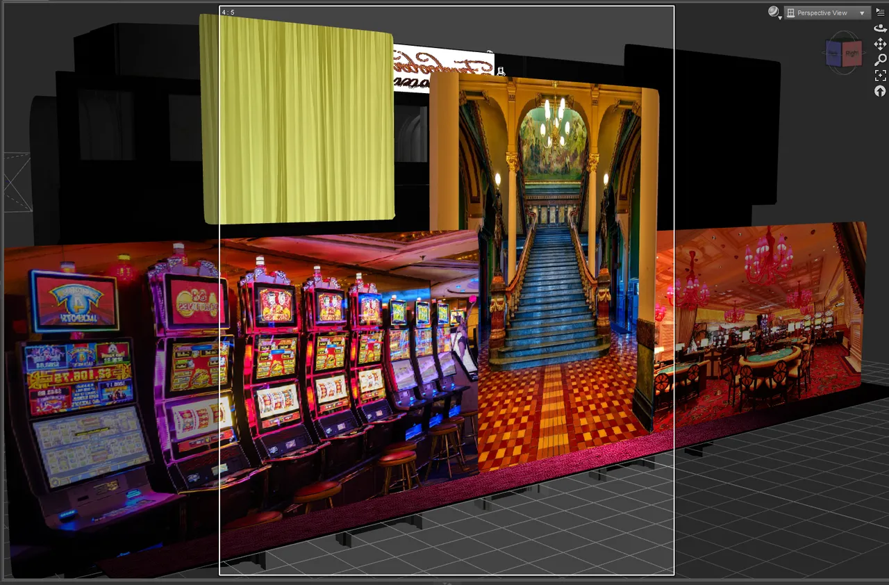
Each backdrop for the casino rooms had a separate image.
I used this curtain from MaxPixel - coloring it yellow and black for my two guest rooms.
The other three images were from: Pixabay and again and finally from PxHere - once I changed it anyway.
My two Freebooter signs were designed on coollogo.com using the Freebooter font! (I didn't know there was such a thing!)
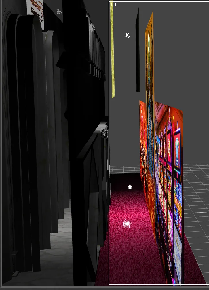
From the back, you can see the backdrops quite clearly. I did this by simply editing the surface values of the backdrop piece. (any solid wall/object would do the job if you need it.) I "browsed" to the wanted image and selected it.
Lighting and Camera
Next, you can see some of the point lights I used to put light onto the images of the backdrops - not completely necessary once I used the emissive settings on the lighting, but they do help still. You can also see that the floor is a different piece than the main part.
In the front, I used spotlights to highlight the entrance and the front of the building.
The camera (currently selected) is also in this picture. Viewing my scene through it, I simply move it until my scene is in the correct position.
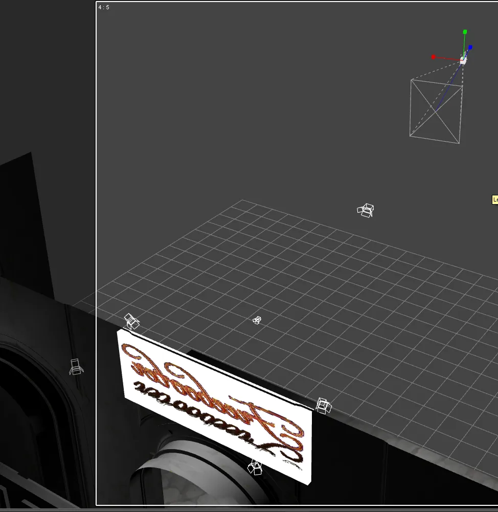
Rendering
I looked at my render settings and tried to work out how to set the camera.
I tried a test render and it was…
A total fail.
WAY too much light!
I double-checked that the headlamp on my camera was off… Check.
I tried a couple of different camera settings. Still no change.
Finally, I started turning off the lights… Still too bright.
Eventually, I was down to NO lights and nope, still way too bright!
I’m talking all that marble white shining back into your eyes, flooding everything!
That’s when I finally saw something about the “environment” settings. The default on DAZ 3D Studio is a “bright sunny day”!!!
Ah ha!
I don’t want a bright sunny day (not on this picture anyway), I need something dark – though I would have accepted the light of a cloudy afternoon.
I played with those settings, turned down everything that looked good… and rendered again.
Voilà!
Suddenly, things were looking – normal!
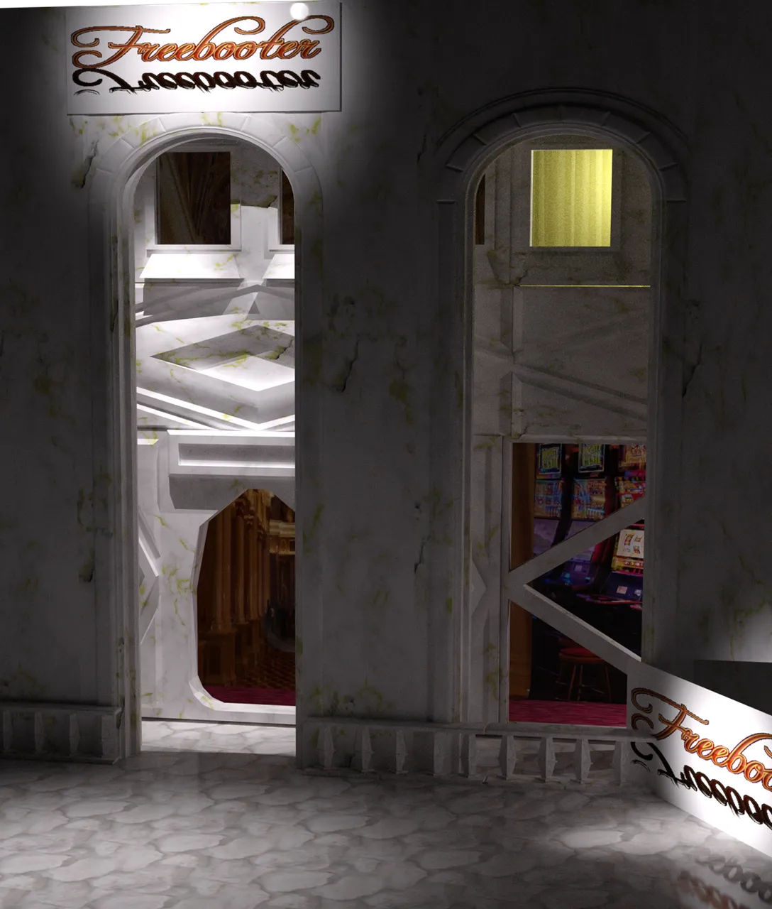
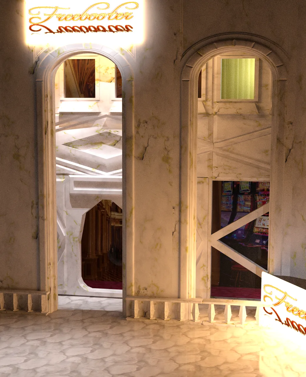
But now, I still had dark signs – or signs that were only lit when I had a light in the right place – where it would actually turn up in the render too… so that was no good either. So.. how to make things glow.
The main trick turned out to be in one of my scene builder settings under lighting (try searching for “emissive” in your search bar.)
I clicked on the sign, double-clicked on “emissive” and suddenly, I had a blazing light! I had to replace some of the image maps with my sign again, but suddenly, I had a sign that would be bright at night!
I rendered at this point – don’t know how long it took because I went to bed, but the next morning, I was very pleased with my results.
I wanted to see the downstairs rooms better lit - and now understanding how to do it, it was an obvious thing to do now. I had to turn it down a bit too - easy for it to be too bright.
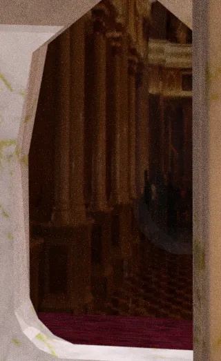
Then, my daughter looked at it and didn't like the spirit lurking in the doorway. I think it's just reflections, but apparently those can hide the more sinister... I admit that I didn't really like the first image anyway, but didn't know why.
What do you think?
So, anyway, I went and changed out the one picture and made the backdrops “emissive” as well. I cut their settings... And here is the result.
I love the reflections on the stone walk.
I also did a little bit of my standard balancing in Photoscape which made a nice, but subtle difference.
Anyway, the only thing left to do is to combine my two images and put the title on... I may have to do that "on the road" as I'm not likely to have time to do it tomorrow.
(I'm going to tag you, @jamerussell so you can see what I've been up to with this...)
All work done by myself on: Photoscape, Gimp, Krita, and/or Daz 3D Studio
Cross-posted on: Steem, Whaleshares, WeKu, Hyperspace
Other parts of this tutorial: part 1, part 2
Past tutorials:
- Map Development for Alacantis (on GIMP), part 1, part 2, part 3, part 4
- Cover image for Acting the Part
- Cover image for Brighid's Blood (part of the update).
- Cover image for Birth of the Neví, part 1, part 2
- Map Development for Velantia, part 1, part 2, part 3, part 4
- Map Development for Kranisis, part 1, part 2, part 3, part 4
- Cover Image for Name of the Neví, part 1, part 2, part 3, part 4, part 5, part 6
- Beginning with Daz 3D Studio - my cover image for Mind of the Neví: part 1, part 2, part 3, part 4
Photo salvages:
Droplet, Bellis Daisy, Baby Blue Flowers, version 1, version 2, 2-Spot Ladybug, version 1, version 2, Bridge Over River Kennet
Coloring Tutorials & Mini-tutorials:
Zen colouring #43, Zen colouring #39, Zen colouring #38, Zen colouring #37, Zen colouring #36, Zen colouring #35, Zen colouring #34, Zen colouring #33,
Butterfly Colouring #11, Butterfly Colouring #10
Miscellaneous Artwork:
Pumpkin Patch Harvest, Painting Wooded Easter Eggs
Lori Svensen
author/designer at A'mara Books
photographer/graphic artist for Viking Visual
verified author on Goodreads
find me on Twitter
blogging on: Steem, Whaleshares, WeKu, Hyperspace


Join us in the Official Whaleshares server in the text channel "the-phoenix-project"