
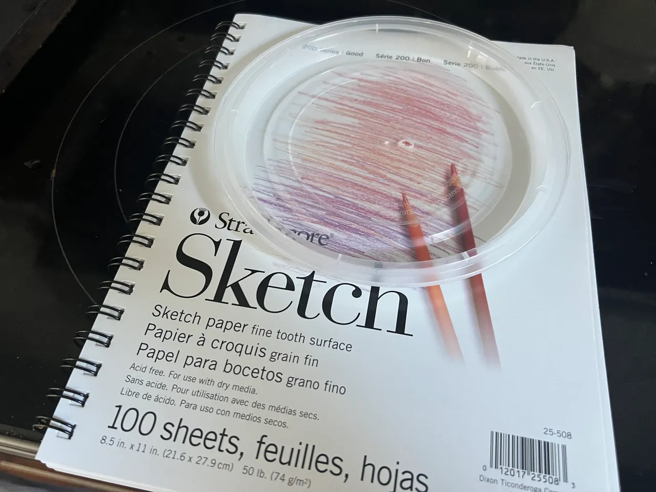
I’ll only be able to say this once. This post begins with the introduction of a newly purchased sketchbook, which I procured solely for the purpose of beginning this adventure. That’s it. From this point forward, it’ll just be the (or worse yet, a) sketchbook.
…ain’t gonna be no whippies in this bitch though, namsain?
I also secured a tupperware lid from some Thai noodles. This will be the cornerstone. This will be the ultimate source of my perfectly uniform avatar circles. yep, a tupperware lid.
Now as I mentioned before, first I bit off more than I could chew, and now instead of hockin’ it out, I’m doubling down with a full swaller.
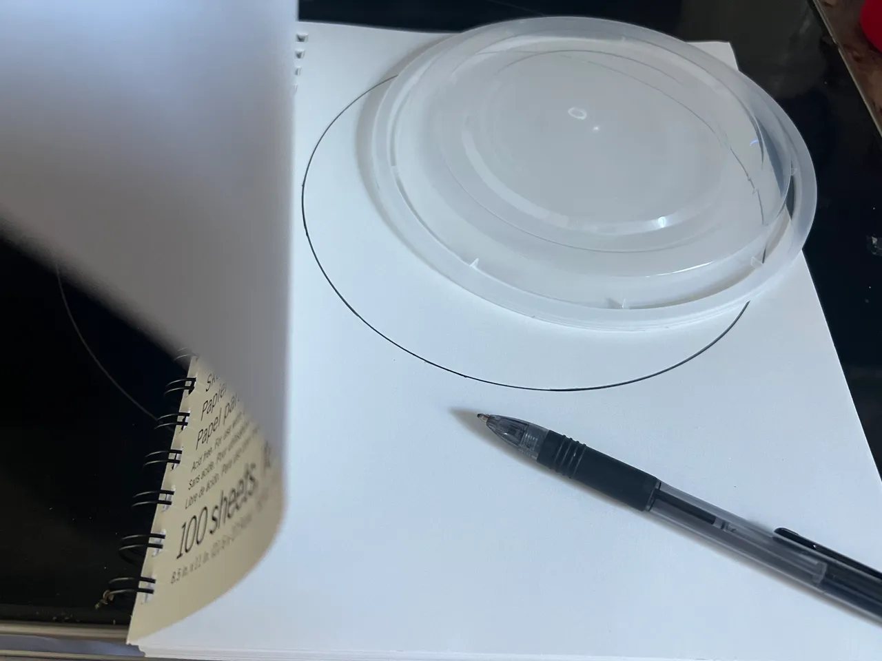
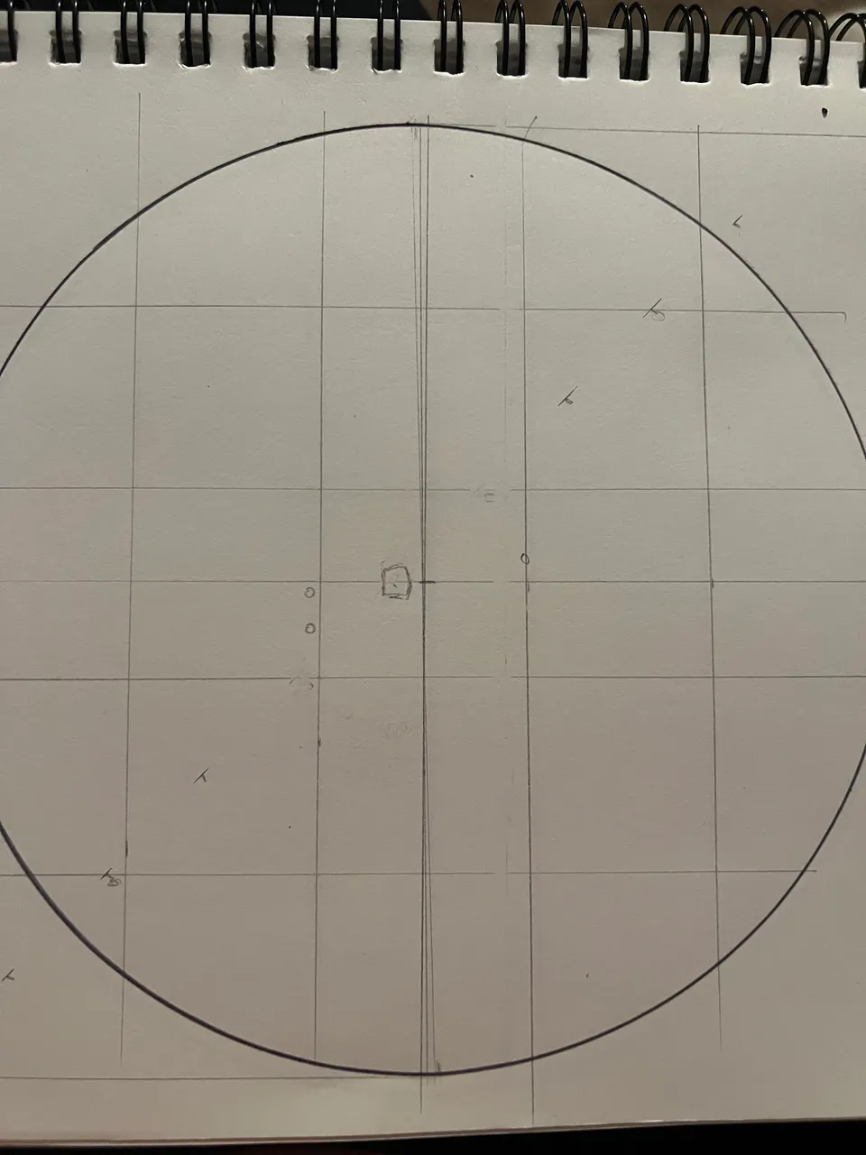
That said, whenever a task seems to big to tackle, it helps me out a lot to just break it into smaller, simpler tasks. So I started with a circle…I traced the outline of my tupperware lid.
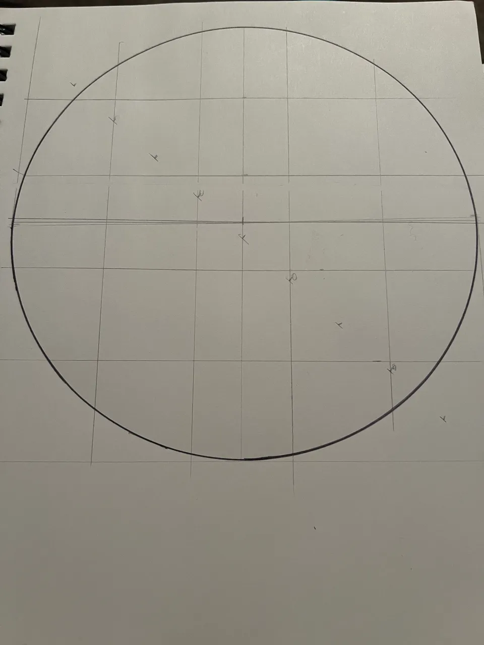
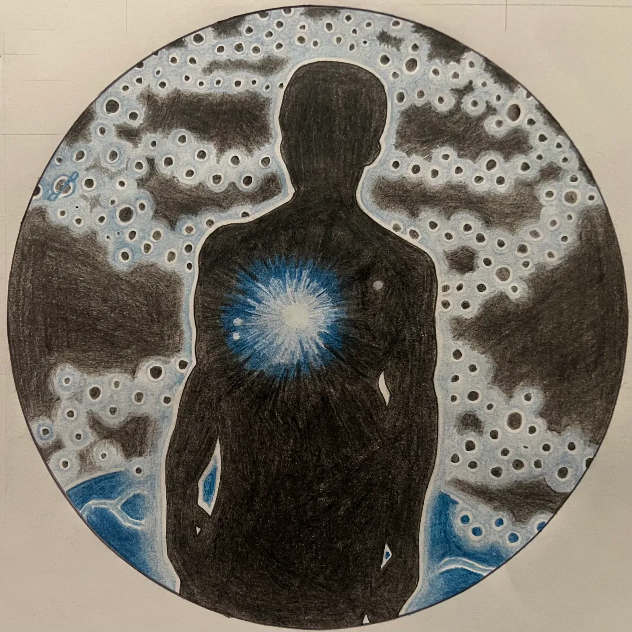
Next step is to work out the gridlines. The spacing on this first one will be the hardest, but once I’ve got this one figured out I’ll use the same spacing for all the rest.
For the avatar, I added center lines in addition to the grid. I’m definitely taking this a lot more seriously than I take my lil’ whippies. Center lines will be necessary to lay out the gridlines for my sketch, so I may as well have these references available on the original image as well. More data points, y’know?
LINE WORK
I started out by adding horizontal and vertical bisection lines.

Then I extended the vertical lines so the left line went up and the right line went down. These will be used as guidelines for an old woodworking trick.
Since I want 5 even sections, I will choose a measurement that fits the space and can be easily divided by 5. In this case I chose 10 inches. I lock the ruler’s zero onto the left extension and rotate it down until the 10 inch mark is squarely resting on the right side extension line. Now I can mark every other inch and run vertical lines through the markers. This will give me my vertices. The page isn’t large enough to do this trick for the horizontal lines, so I just measured the distance. It was like one and a half inches minus two thirds of an eighth. That’s actually how my brain works 🤣🤣🤣 Could also approximate it at 1 & 13/32…that number is better for record keeping, but when I’m doing the work I actually prefer my crazy version.
Since the measurement isn’t perfect, I made sure to measure this from the left and from the right so I could average it out and ride the center between measurements.

Grid is complete…I could have done like two or three whippies in this amount of time.
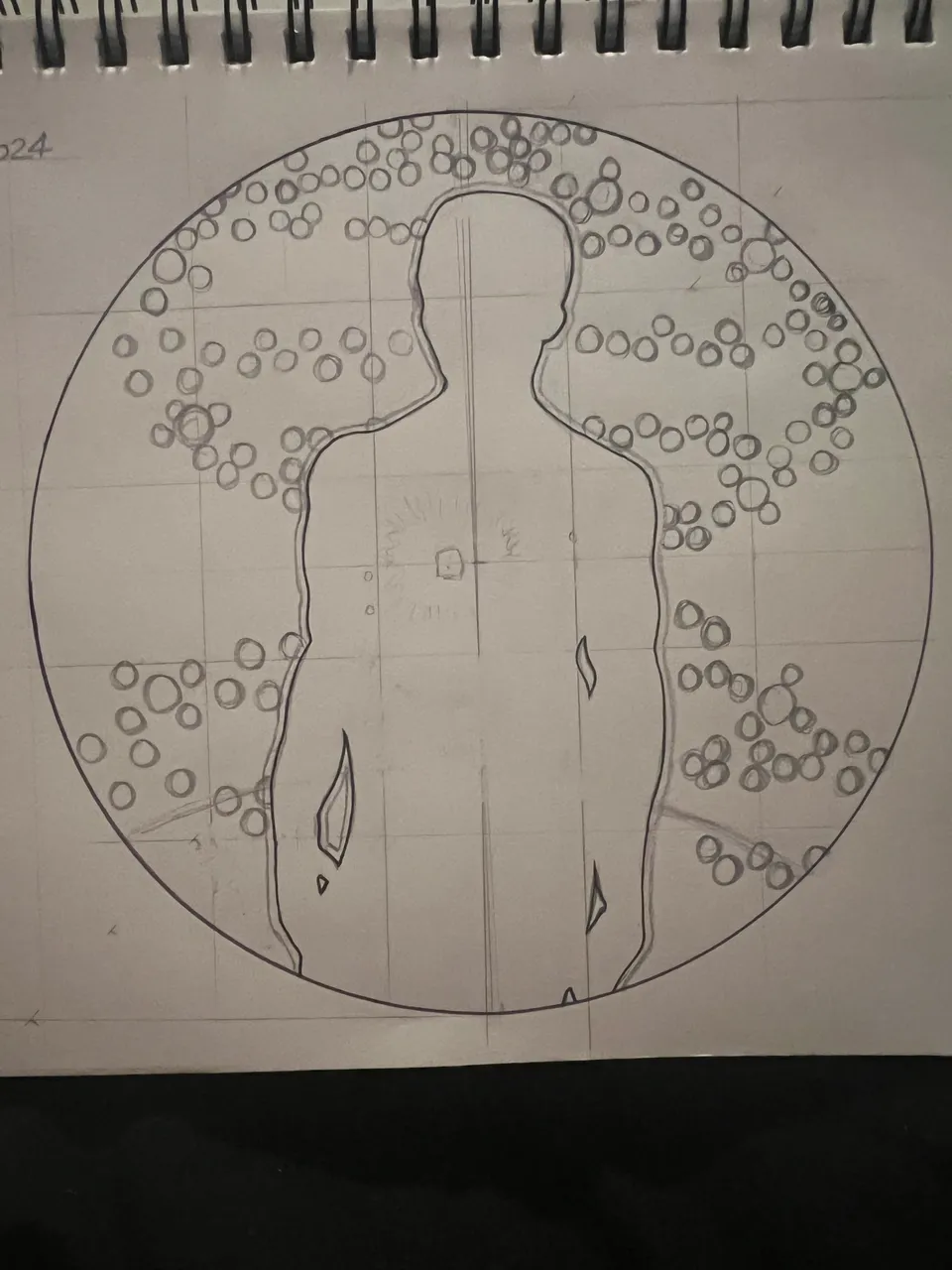
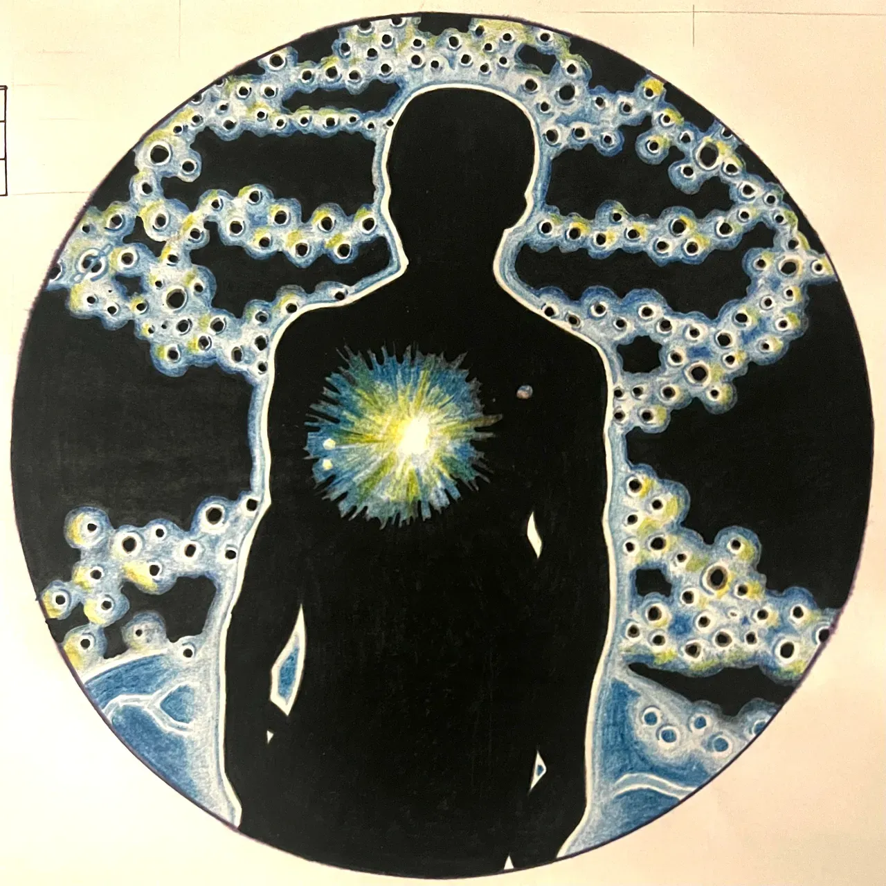
Starting off, I chose to pencil in the heart and stars first.
Next, the silhouette. Outside of the gradient coloring that’s likely gonna throw me for a complete loop, this really is the meat and potatoes - so I took my time trying to get the lines placed and proportioned right.
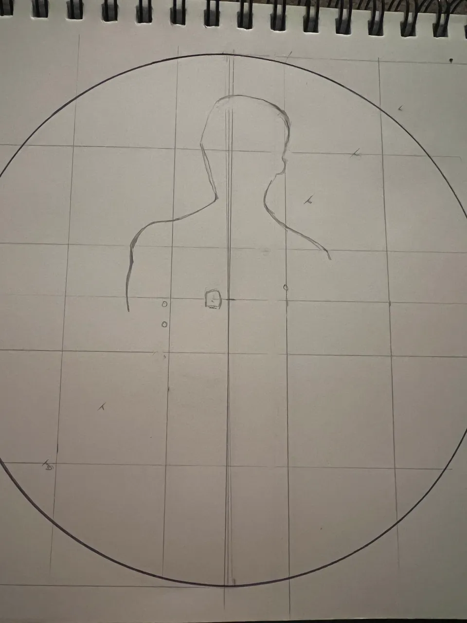


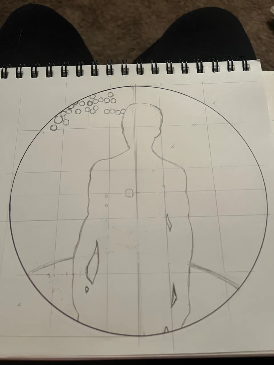
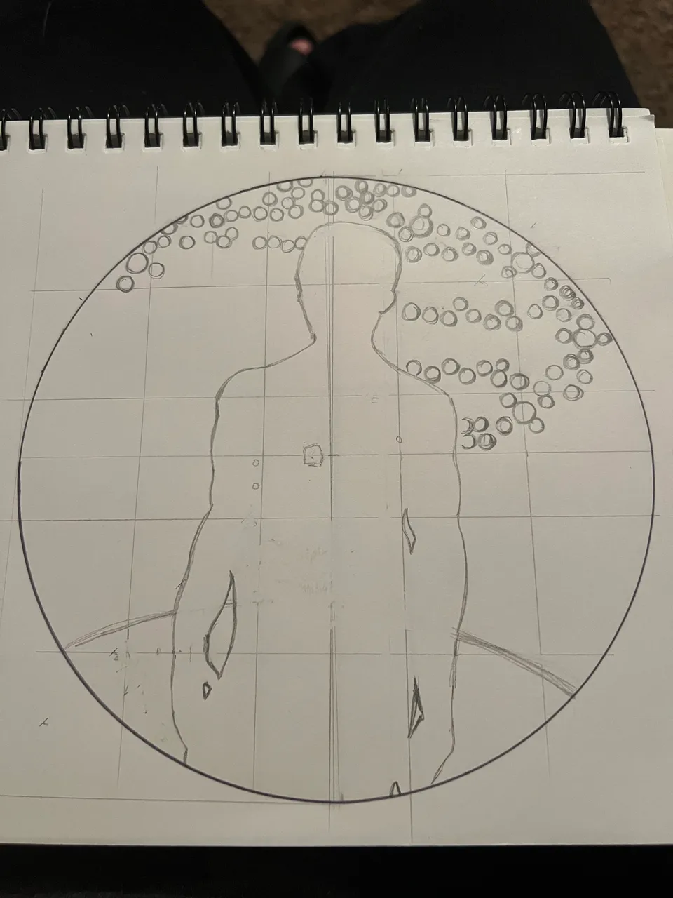
With the basic outlines laid down, I added some scratchies around the sun, arrayed in polar fashion to act as guides. I want to make sure that all the colored lines emanating from the sun are seen as originating dead in the center of the heart...it's important.

INK WORK & COLORING
I gave the silhouette two pencil outlines, about 1/16" apart. The interior line was the first part to be graced by the touch of my sweet sweet Temu pen. The exterior line will be dealt with later.
Next I started erasing the scratchies around the heart, in small groups. I made sure to leave behind enough scratchies to keep a steady radius for my colored array. I don't think I can easily erase the pencil once I've colored over it, so I made sure to clear out each section before adding color.

Probably wouldn't have been a huge deal if I'd forgotten, but I tried to remember to color around the two stars thar sit inside the radiant glow.
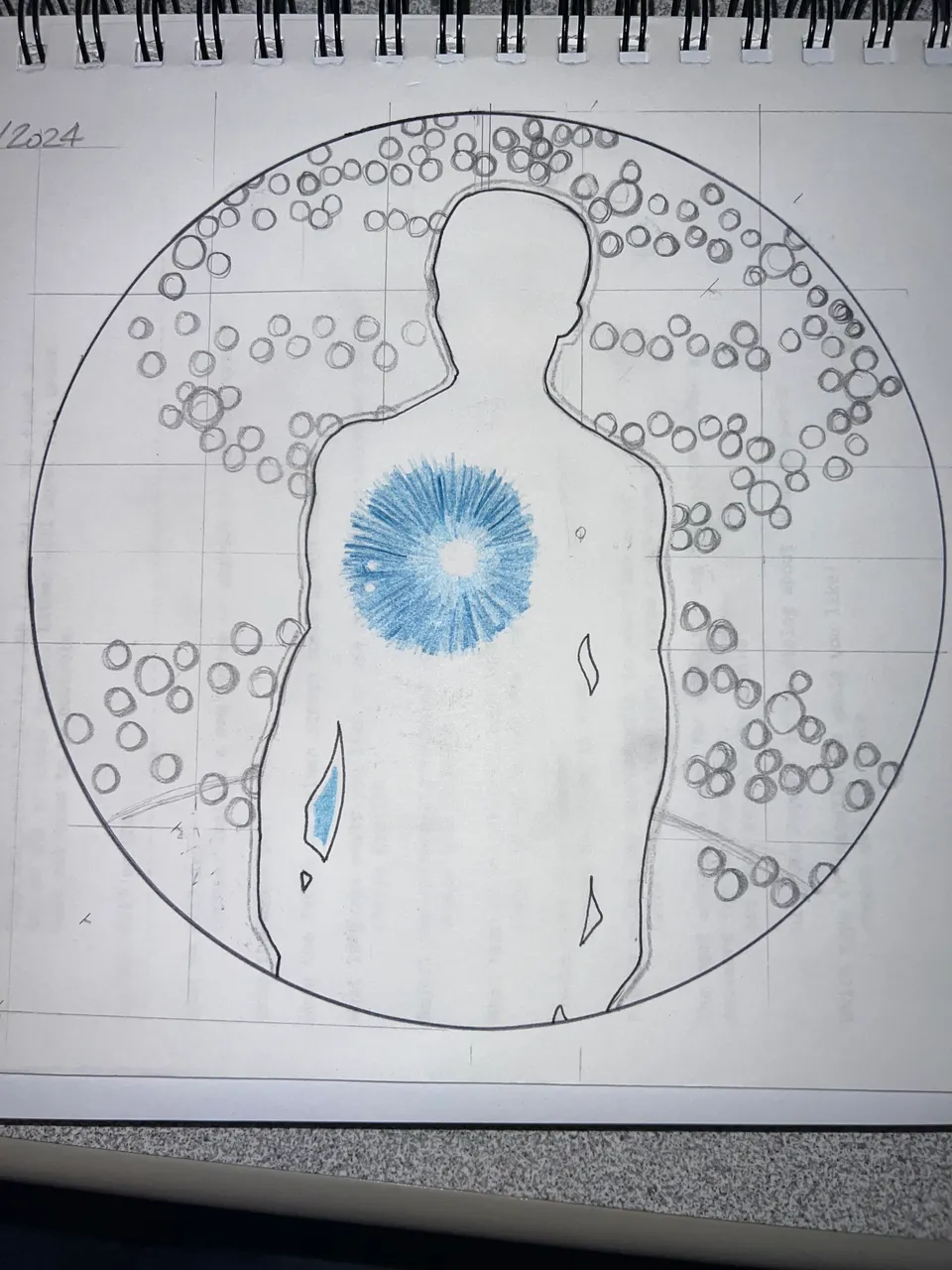
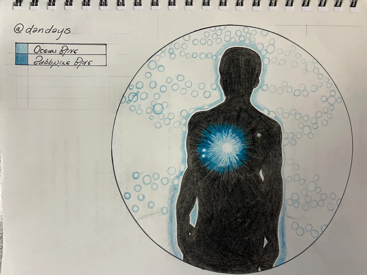
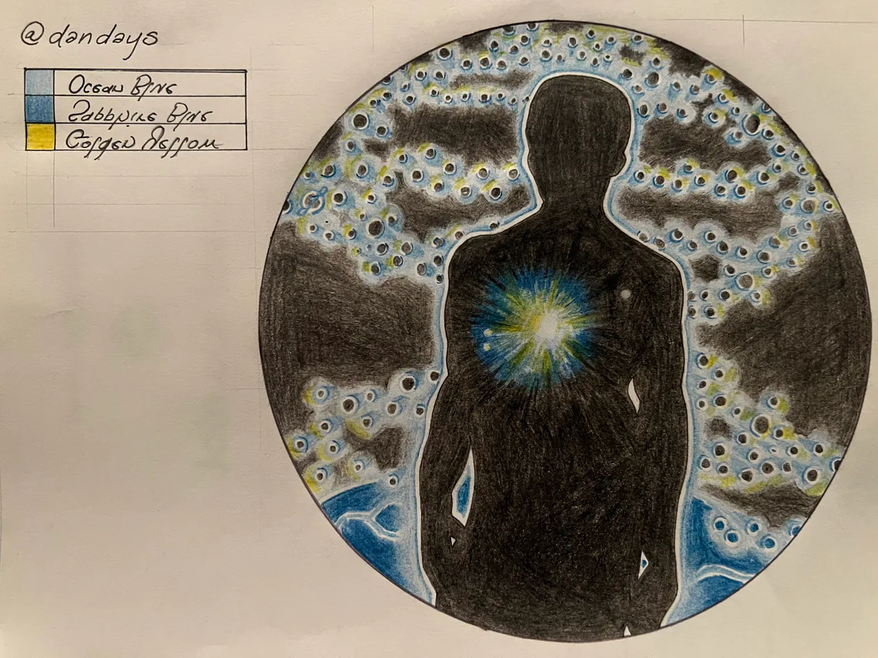
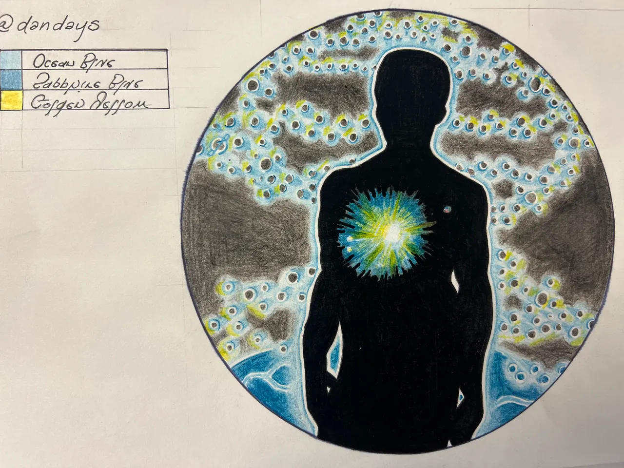
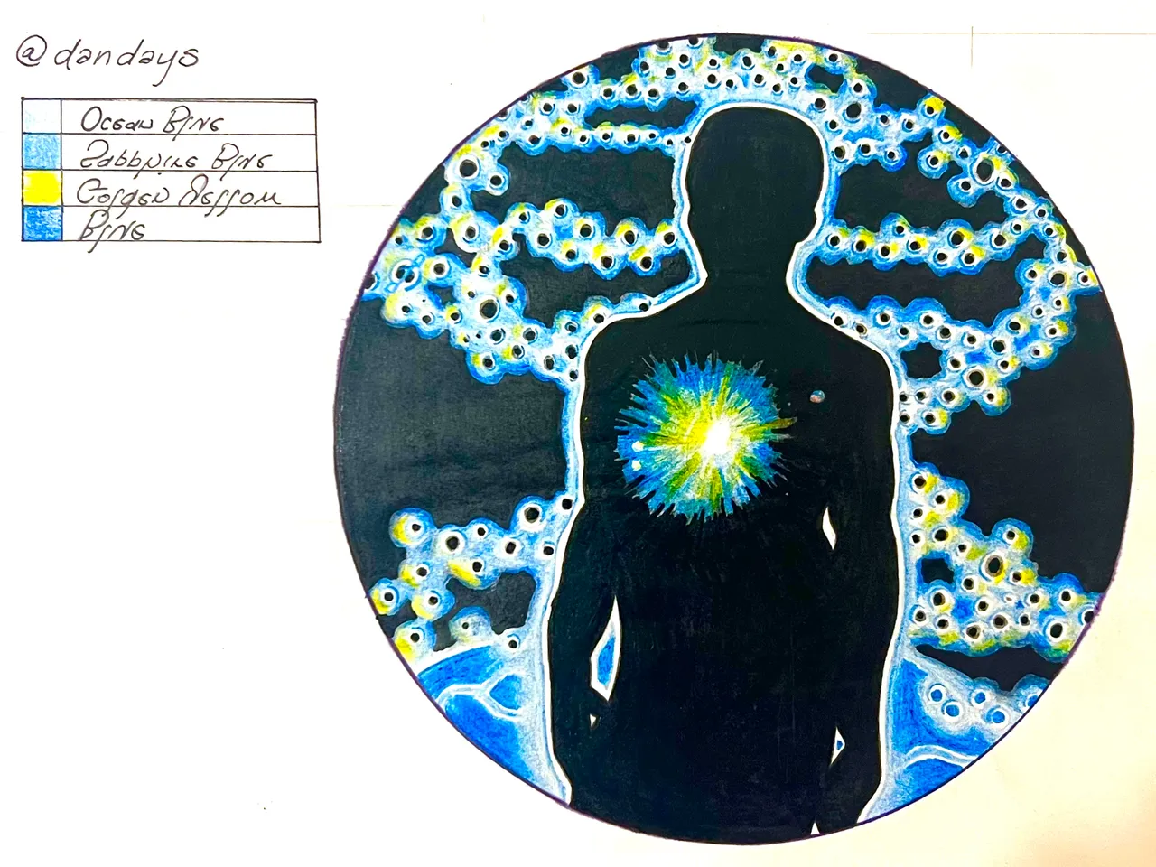
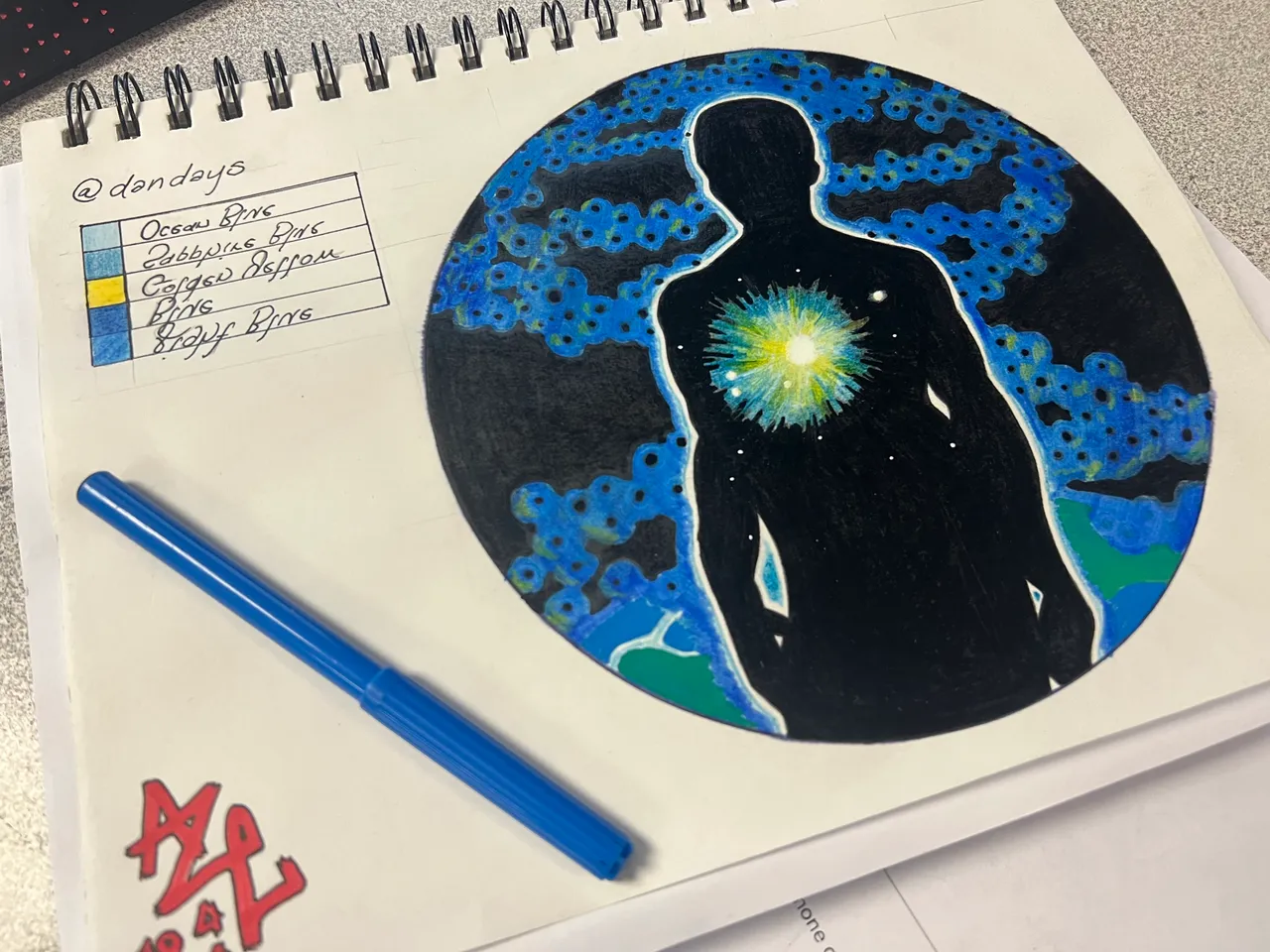
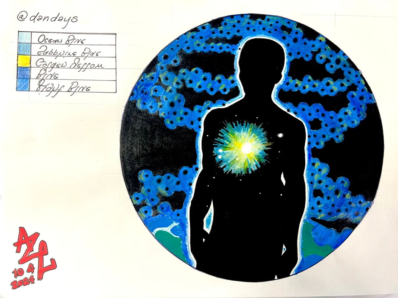
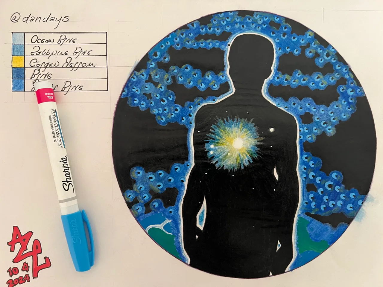
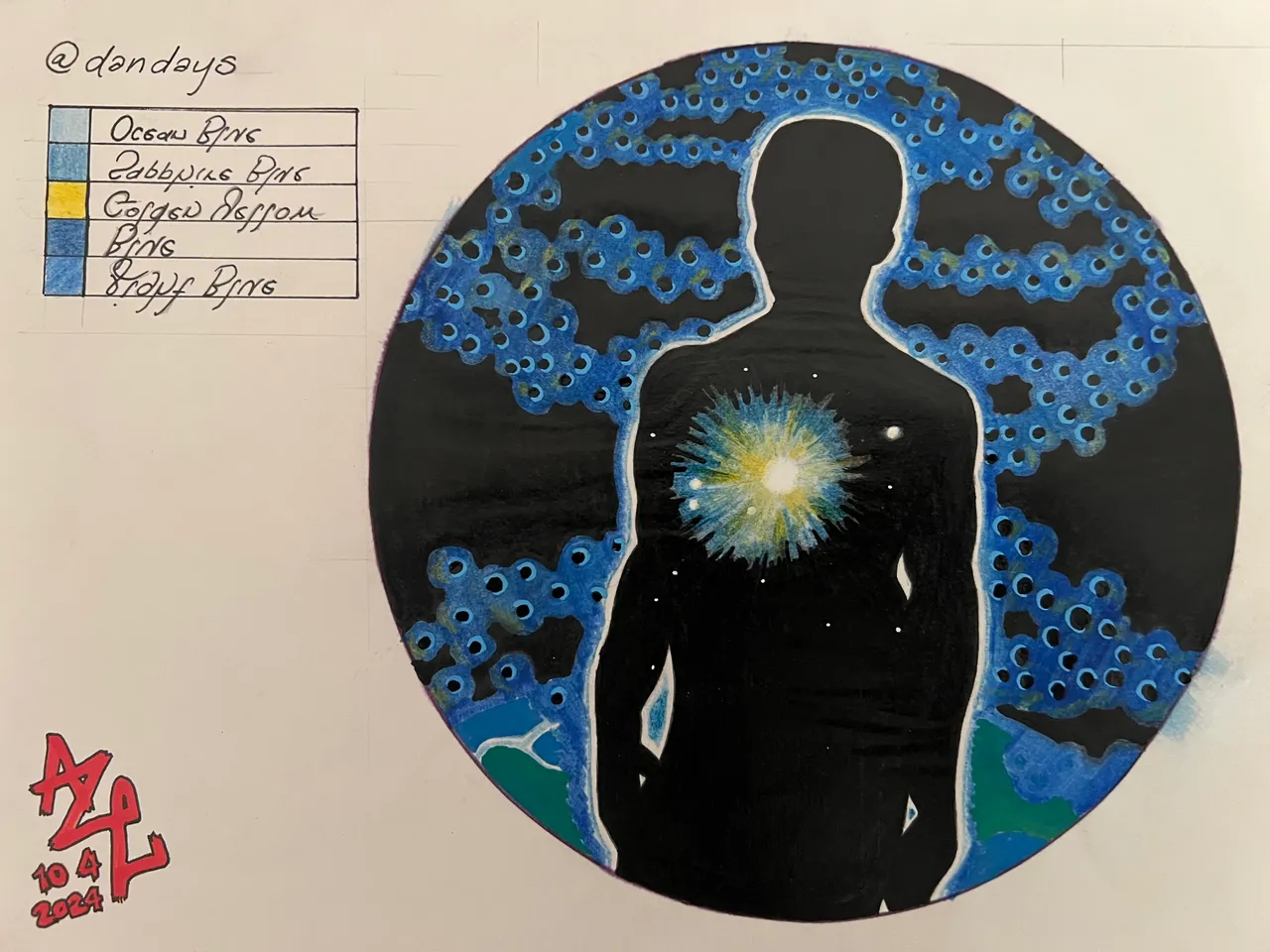
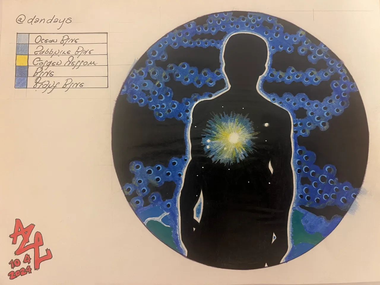
Next I added a little table in the upper left, where I could keep track of the colors used based on the names printed on them. This was mostly just so I could put them away after each use and still be sure I'm using the right colors when I resumed the work later. The inner heart is white/uncolored, the interior ring of the radiant glow was done with "Ocean Blue," and the larger outer ring was a light coloring of ocean blue, with a heavier pass of "Sapphire Blue" over top.
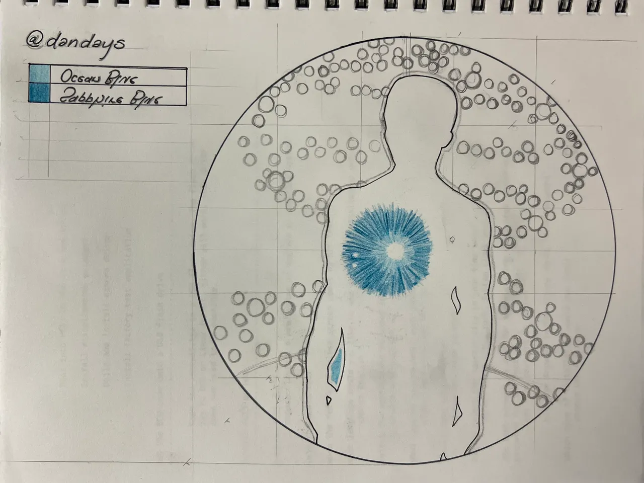
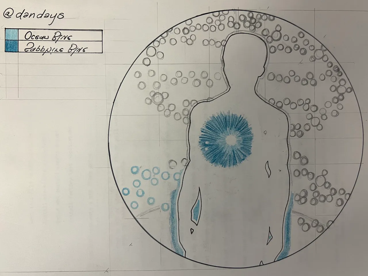
The table gives me a solid reference as to what colors were used, but it would be up to me to remember where each one was used. Next I began getting the blue balls (lol) and the exterior outline around the silhouette. In all cases, I erase the pencil before doing the color.
Pass one with black, filling in the silhouette.

Pass two with black, filling in the silhouette, plus all those blue balls and a first full pass at the silhouette's blue aura.
Filling in black behind the helix, and hitting the earth with some Sapphire blue.
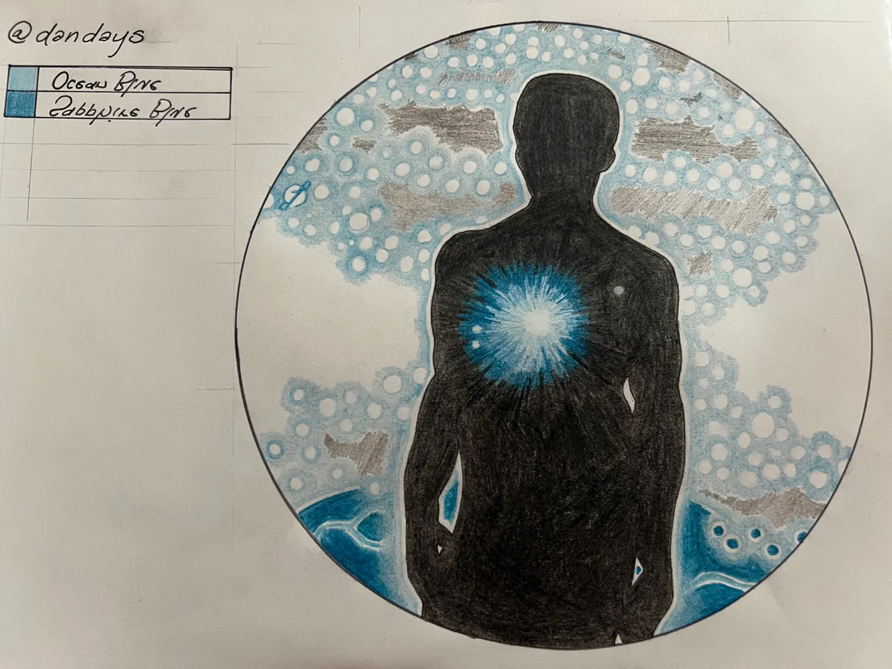
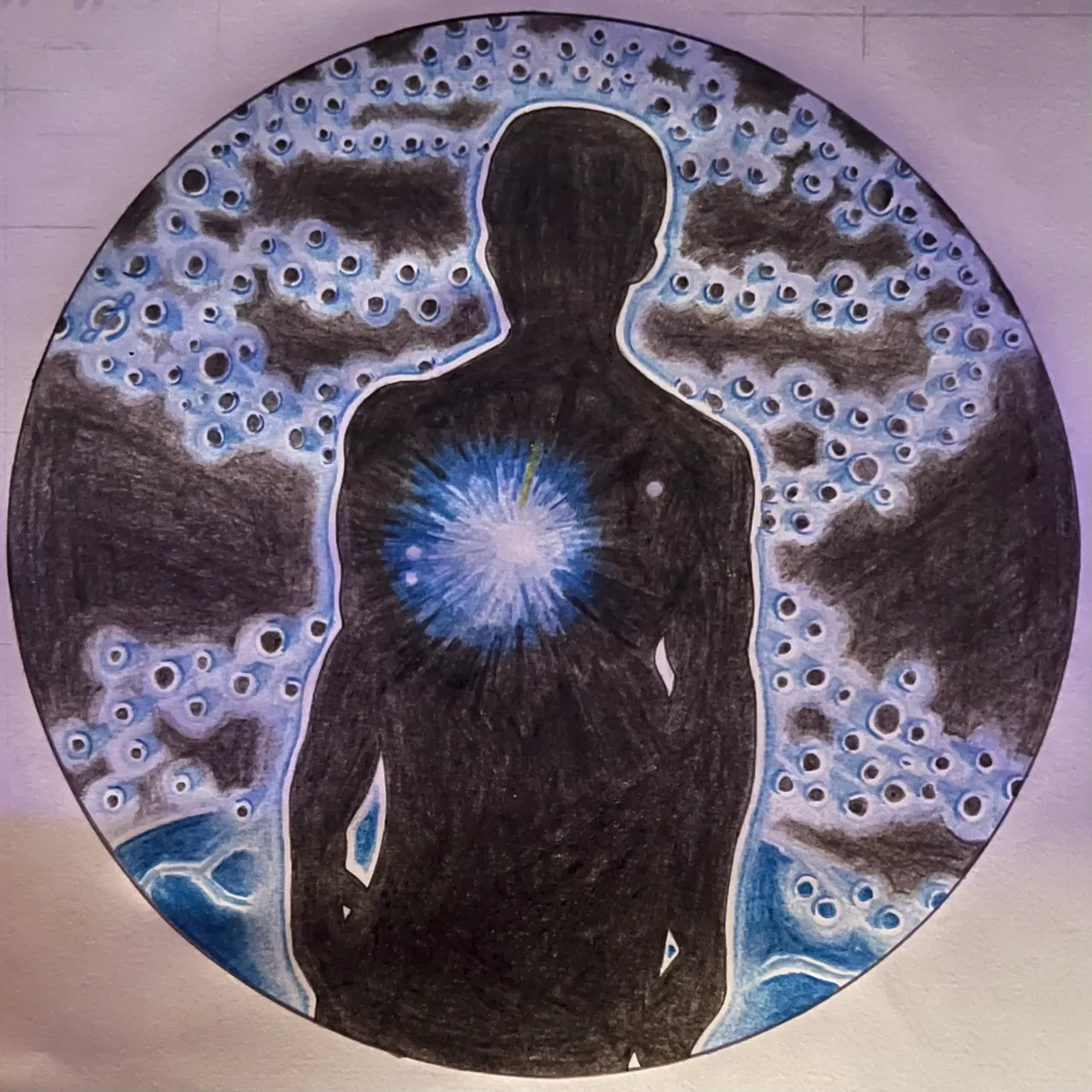
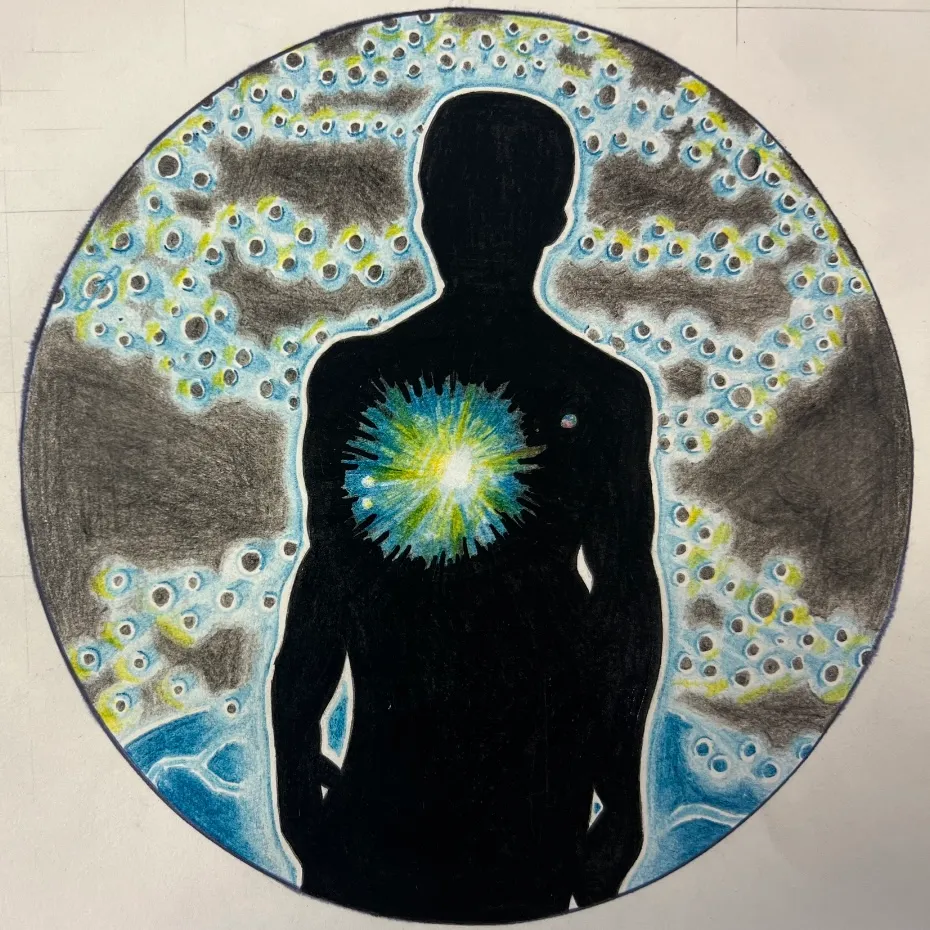
If “true to the original” were the only goal, I would say this might be the point at which I got as close as I can to accomplishing it, but this project had more false endings than a Peter Jackson flick...at any rate, I had been treading lightly up to this point, not wanting to trash the first page in my new notebook - and now I was extra nervous, because this was actually shaping up to look somewhat decent...a situation that could easily deteriorate with so much as one wrong step it felt.
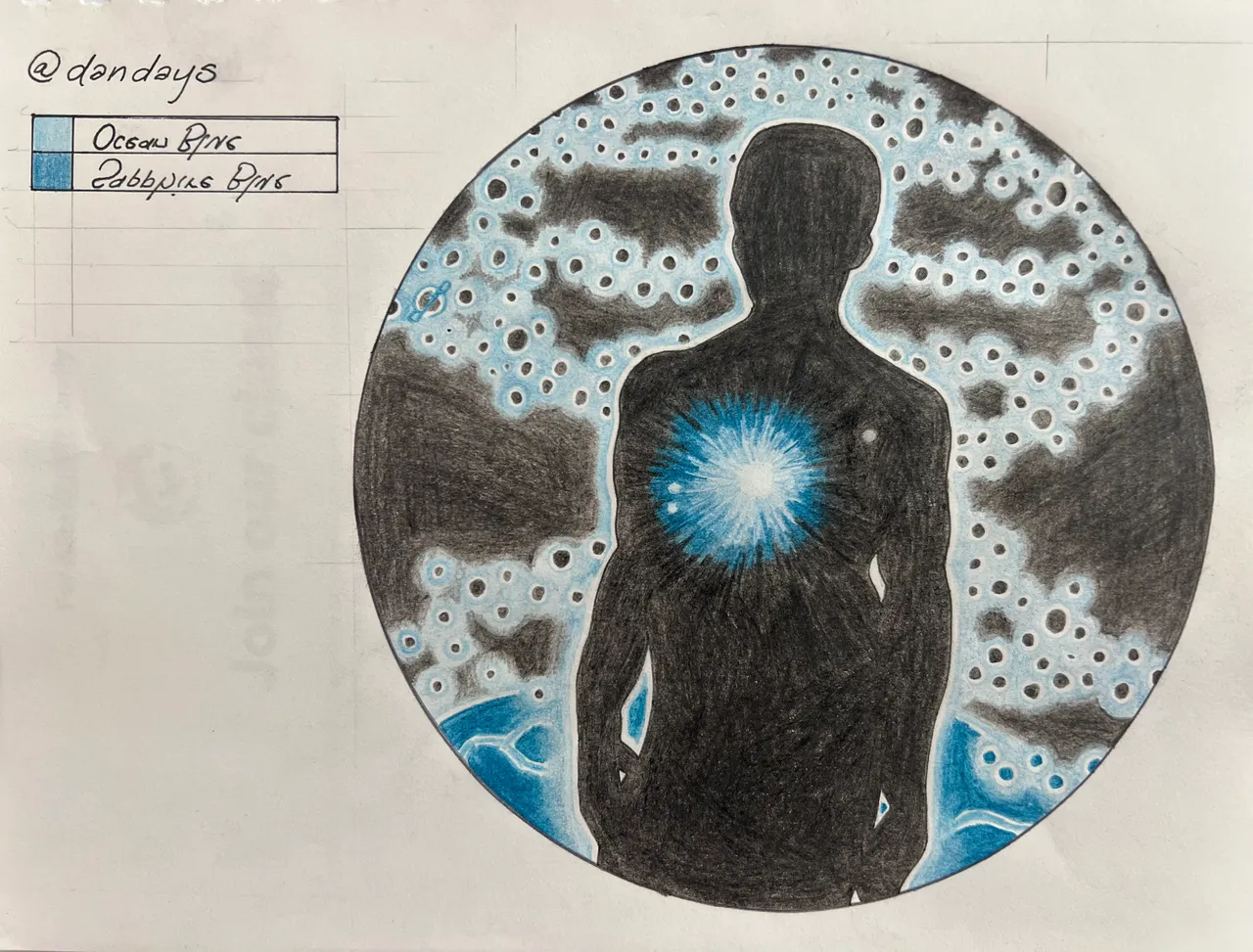
SAVE POINT/EXPERIMENTATION
I took a couple shots of the drawing while it was at this point, so if I destroy it during the learning process, we can still go back…now it’s time to get wild!
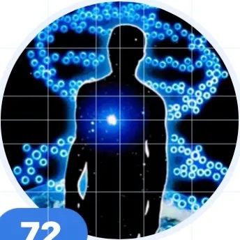
Here’s the original/save point graphic in case we need it. Looking at it now, I can see how desperate I was to play it safe. I've never been a very talented colorist, and this project showed me that this is likely due to two major factors:
- I usually tend to rush through things
- If I get as far as taking my time on something, I become exceedingly risk averse, and call it finished before I really challenge myself at all.
The results in the past being thus either half-assed, or ultra pedestrian. Not saying it looks bad at this point, just saying I'm super grateful for how D&A's and this project drove me to push beyond my perceived limitations.

Next, I wanted to try to illustrate that the light from the heart is what’s illuminating basically everything else, so I used the sapphire blue and did sort of a reverse shading relative to the heart/light source. This was a gamble, and perhaps it would have been wiser to do standard shading, but once I commit, I finish with the plan.
Here the drawing is in the same state, but the lighting is different. I’m not using any edits or effects for any of these shots, since that can be added at any point if needed. Honestly, I think the lighting made this my favorite version. I hate how splotchy the black parts all came out though, so you can bet that the experimental phase will eventually try to do something with that.
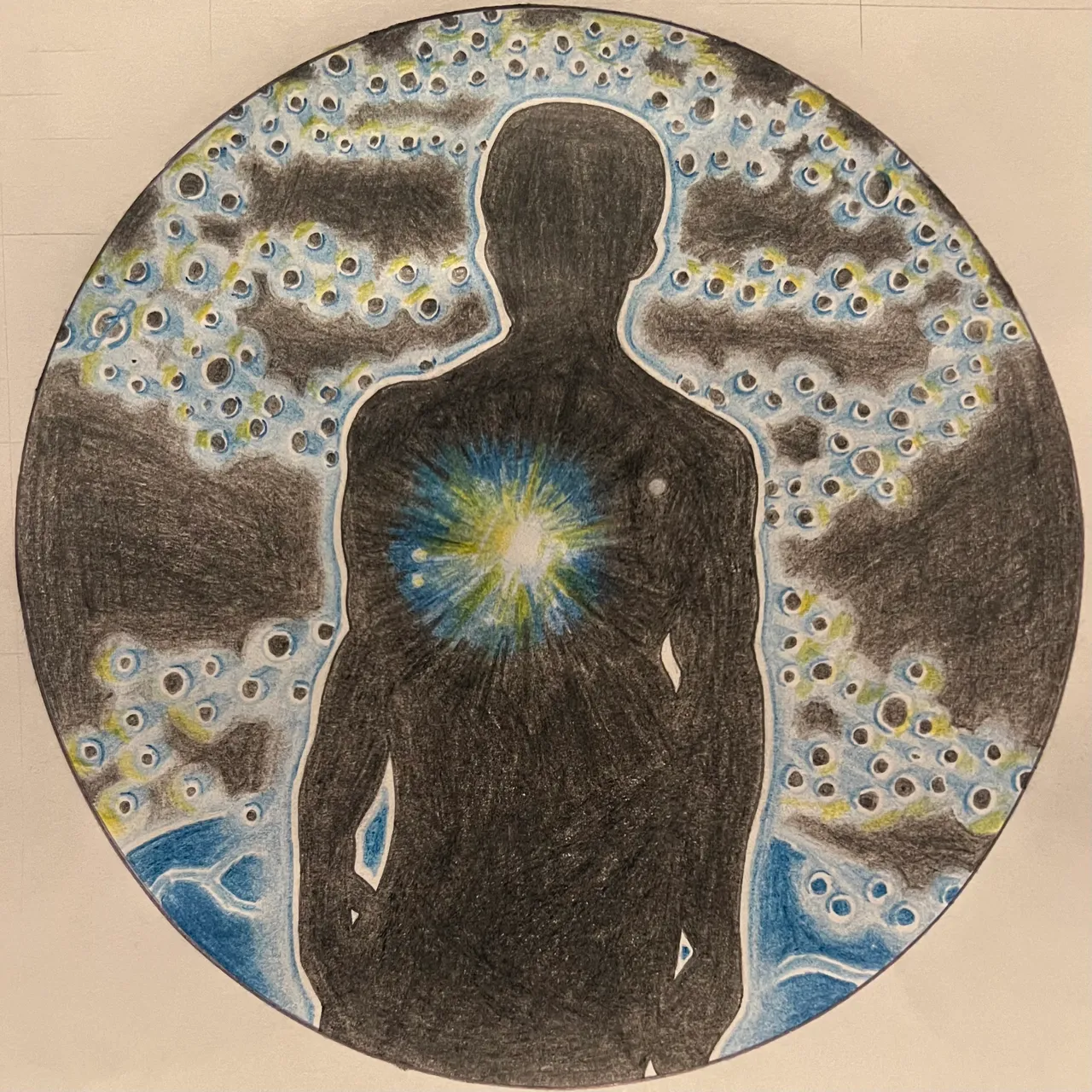
I added yellow, and by way of color combination this meant adding in some hues of green implicitly. This addition took me further from my comfort zone than I've probably ever been with a drawing...does that sound ridiculous? No matter, I swear it's true. I added the yellow, not really knowing how to handle what I was creating. I liked it in the heart, but felt immediately that I should have switched the sapphire blue and the yellow, so the yellow would have been on the sun-facing side.
Below, the same image has just been cropped down to a square.
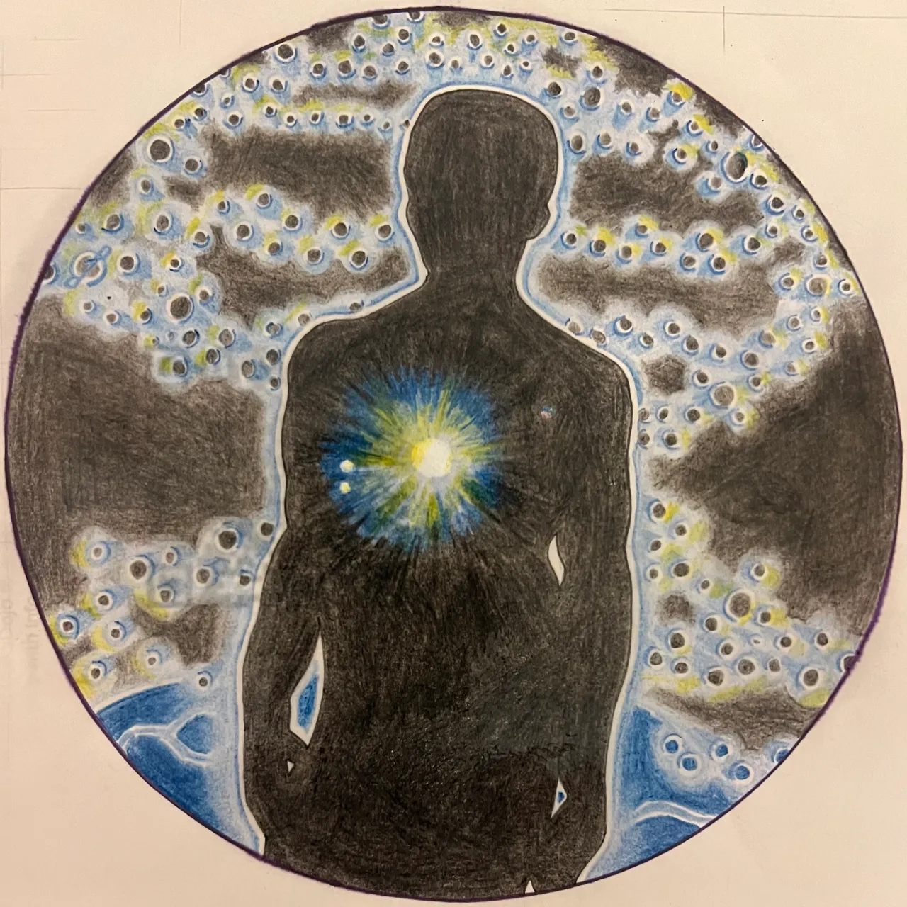
Next, the drawing is unchanged, but here it’s been saturated with hairspray. The hairspray did not have the effect on the water colors I was anticipating - in fact they didn’t really even smudge when I tried by hand…for some reason the hairspray failed to dissolve the medium...the Temu pen however, had a nice dissolve and spread effect.
For an experiment to be successful, we should learn something. My hypothesis was that the hairspray would dissolve the medium, and that I could use that aspect to add a natural abstract quality to the overall composition. My hypothesis was wrong, which means I learned something, which means the experiment was a success!
The little stars inside the silhouette…the one all alone on the right side. I colored that with blue, green and red. Typically when I focus on Sirius in the night sky, just off the tails of Orion’s garb, I see the Dog Star flashing these colors. I am told that ancient cultures worshipped this binary star and venerated it for its life-giving powers, so I chose to pay homage to it here in this way.
So here it is, saturated with hairspray. Although the hairspray didn’t have the dissolving qualities I was hoping for, there is always a chance it will make a decent fixative.
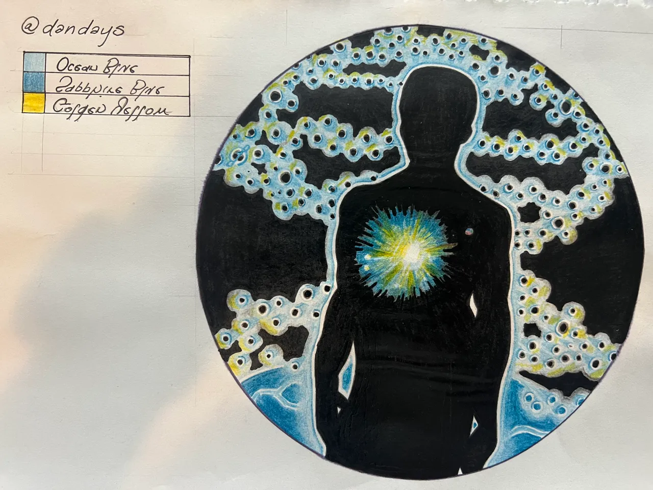
Still disappointed with how wimpy the black parts look, I decided to try acrylic paint. I started with the silhouette. Now that is more like what I wanted to see.
The stark division between the black of the silhouette and the previously-fading edges of the radiating illumination was an undesirable side effect, but the fierce blackness of the acrylic paint was worth the trade. I would just have to figure out a way to fade the sun's edges again later.
For now, I had a solid blackness for the chasm of space, so I went ahead and painted the rest. All those layers of colored pencil, obliterated. Perhaps they prevented the acrylic from bleeding through though, like primer for paper.
Again, just cropped to a square; same drawing.

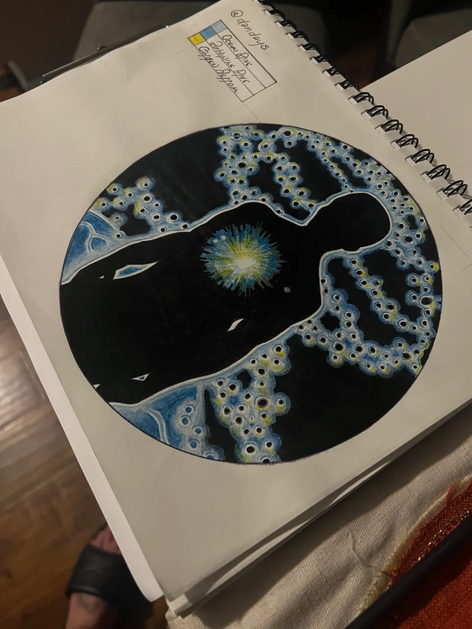
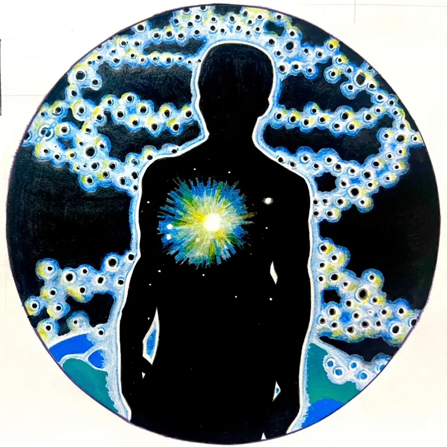
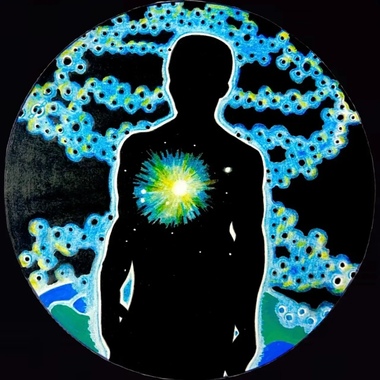
Using a pencil labeled "Blue," I did a pass over all the blue areas, particularly the helix and the earth. I pressed lightly for the most part, just trying to bring a little more color saturation without losing the helix to the darkness.

I think here I increased exposure to get a pure white page and lightly boosted saturation to reclaim the color that was lost in over-exposing.

At this point, I thought again that I was done. I took a lot of pictures because I was so please with myself.

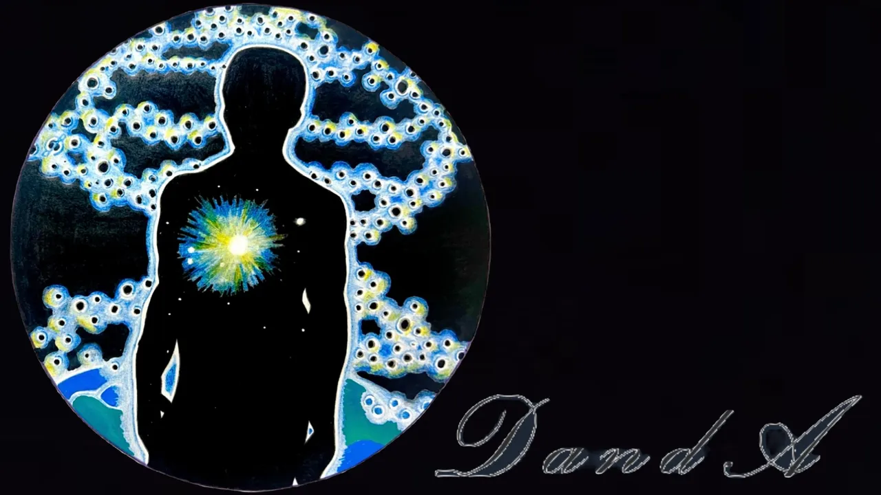
I cut it out (digitally) and put it over a black background. I became even more convinced that it was complete, so I squared one in case D&A wanted to use it as his avatar, and even added the signature I see on his posts to a copy...


…but when I saw my new version side by side withe the original, I knew I must not yet take my rest - there was work yet to be done.
I busted out the Light Blue pencil and did a heavy pass over the entire helix.


Again convinced my composition had now seen its zenith, I ran through the process again, putting it over a black background, creating a squared copy, and finally a comparison issue. The colors weren't perfect, but my risk aversion was reaching also its own peak, and I was hesitant to push myself beyond this comfortable spot. In fact, I was done.
I added my dated signature to the bottom of the page and dotted in the rest of the stars within the silhouette.

...but something told me I could take this further still. Using a blue alcohol marker, I filled in the helix completely again. The result was this beautiful and captivating shade of blue, but it felt somewhat...too dark.
I tried removing some of the marker with a paper towel and some windex, but there was no going back - and in the process of trying to restore my piece's former glory, I smeared blue ink into the almost perfectly preserved white space around the silhouette (shoulder on left) and outside of the circle (lower right).
Refusing to accept defeat, I took the lesson I had learned after the initial inverted shading thing, and tried doing a standard highlight with blue acrylic paint. I made crescent shapes around the helix' dots, oriented in a way that would hopefully create the impression that the sun was illuminating the helix.
The crescents were fat - a byproduct of the paint marker's unforgiving fat tip - so I tightened them up by redoing the dots with black acrylic.
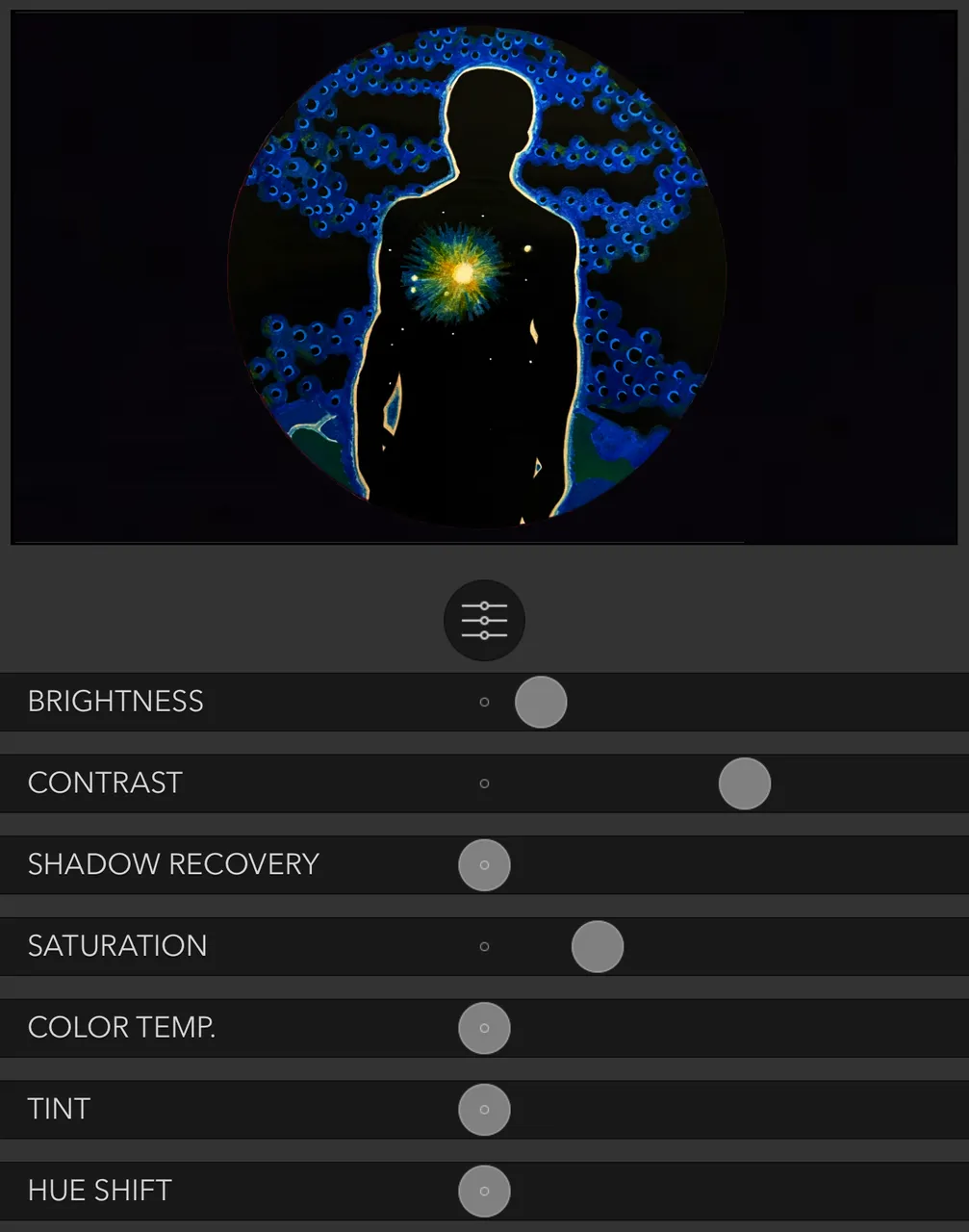
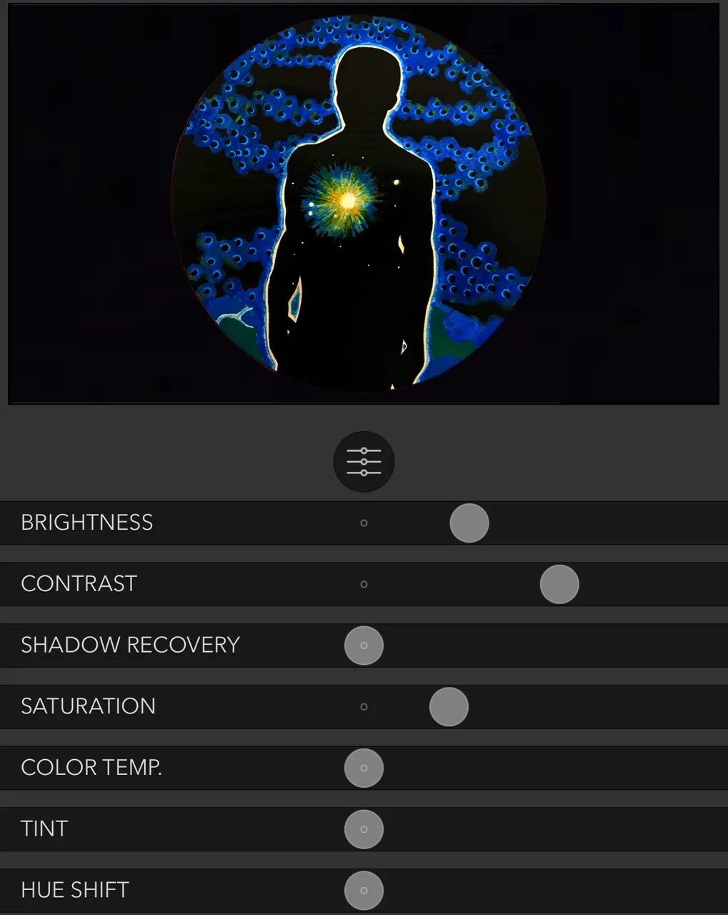
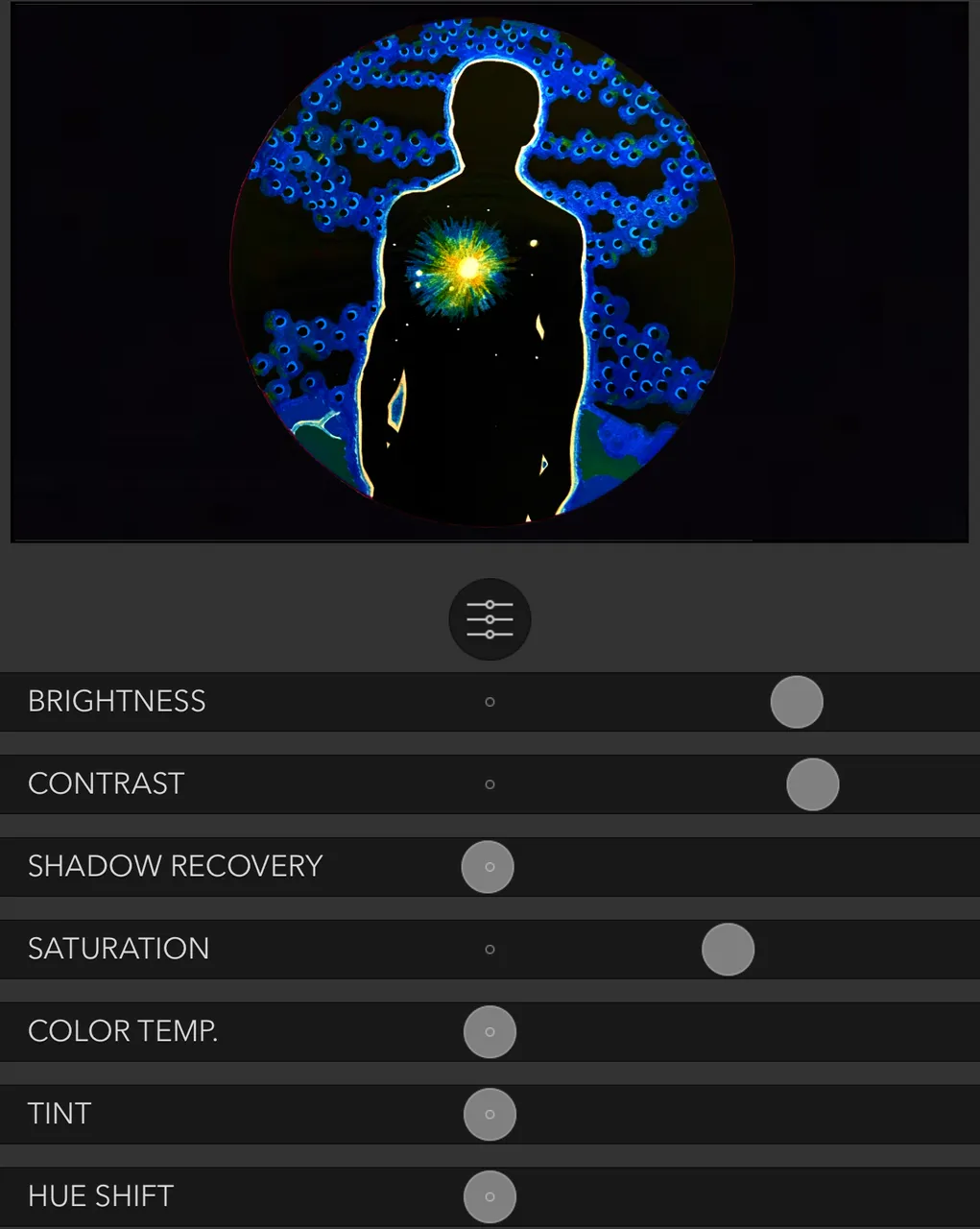
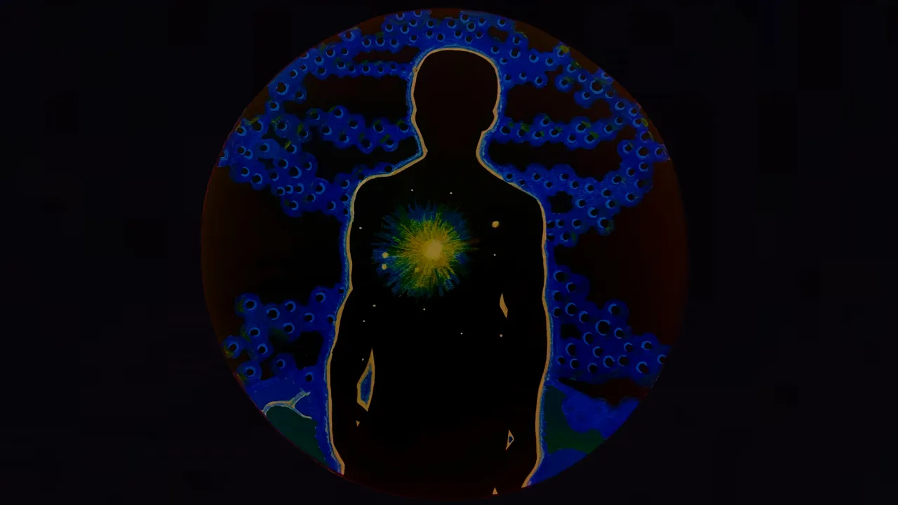
Took the picture, cut out the circle and put it over a black background, and this time started using some basic photo adjustments to get this closer to what I had in mind...here are a few examples of the edits:
| Column1 |
|---|
 |
 |
 |

Here I realized that the Windex mistake had also gotten some blue in the white glowing outline - at this point we’ve come too far to let that stand.

White acrylic paint touch-up abover the shoulder on the left.
The interesting thing is, the photo and the photo edits are different every time. The lighting at the time the photo is taken has a major impact on the outcome.
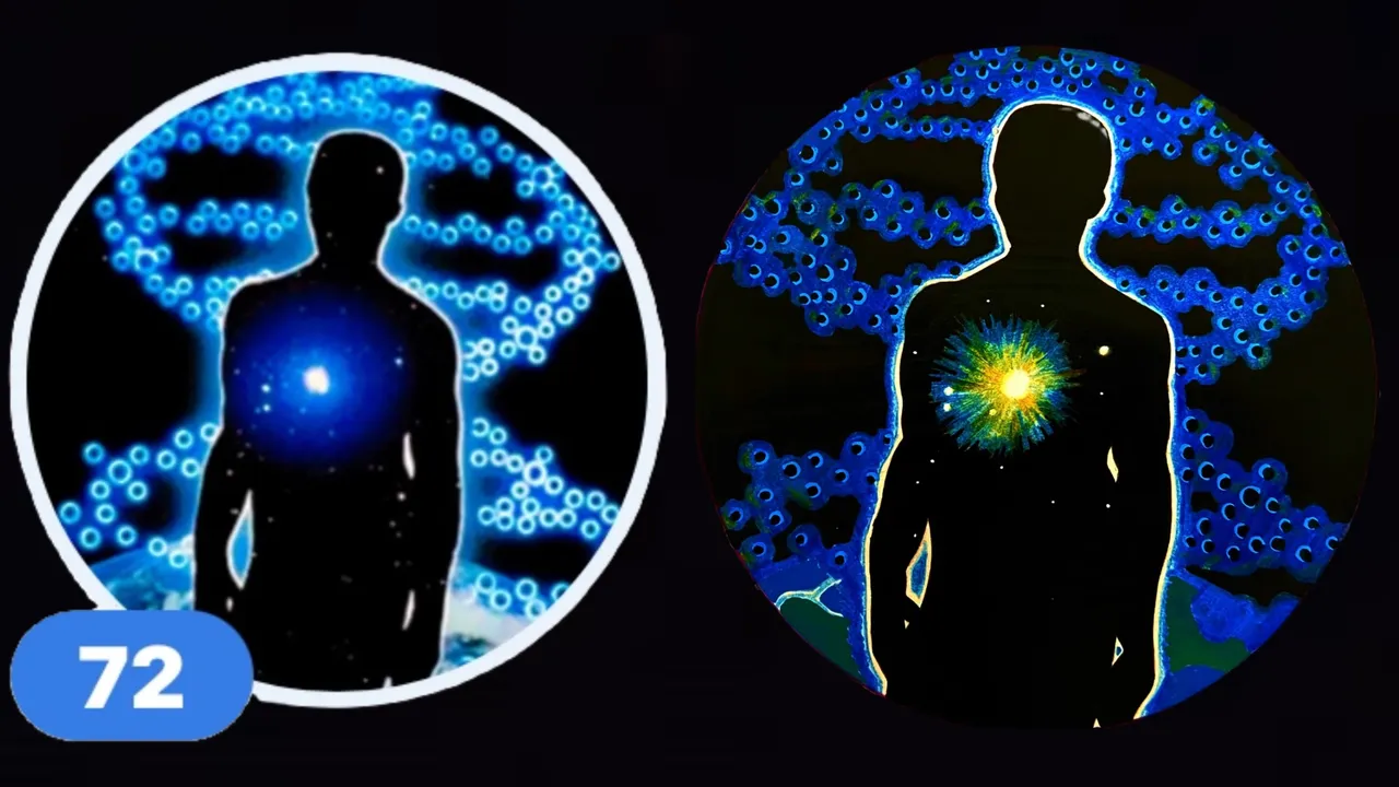
For whatever reason, after cleaning up the blue smears, I was unable to recreate the same lighting conditions and hence, could not get the same shades of blue as before, but this led to what I felt was the final epiphany - a slight hue shift towards the red end of the spectrum gave the helix a really unique ethereal glow, and breathed a stunning amount of life into the sun...in this moment I was convinced that the blind chicken had pecked the corn - I had stumbled and lucked my may into the completion of my first real hand drawn avatar.


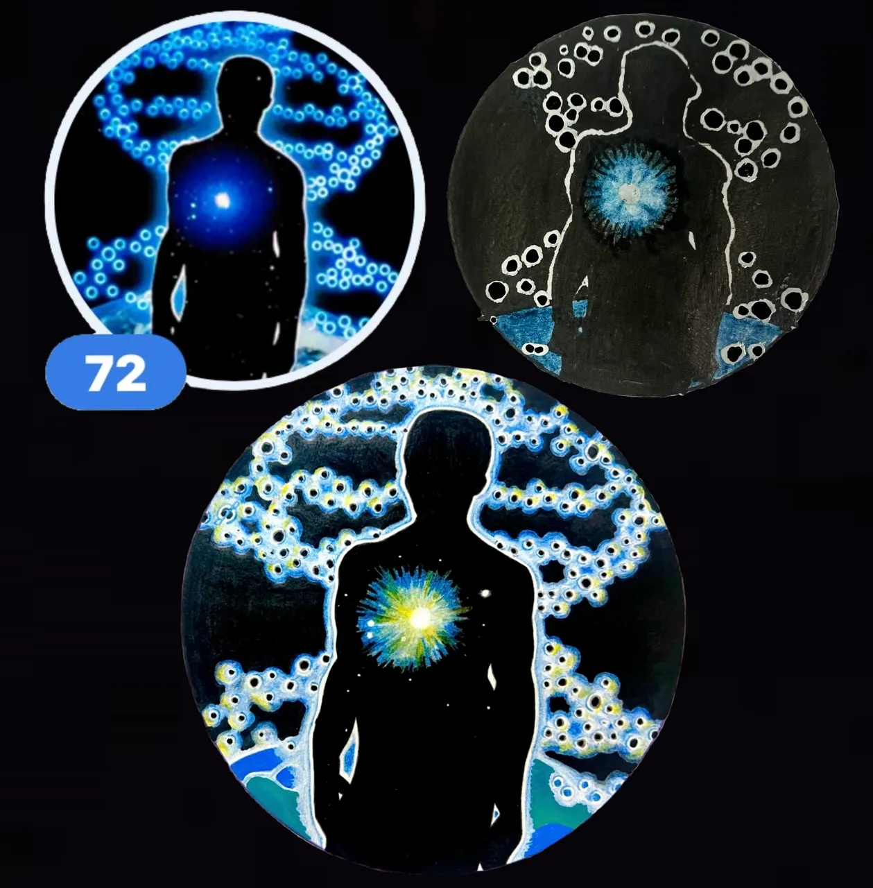
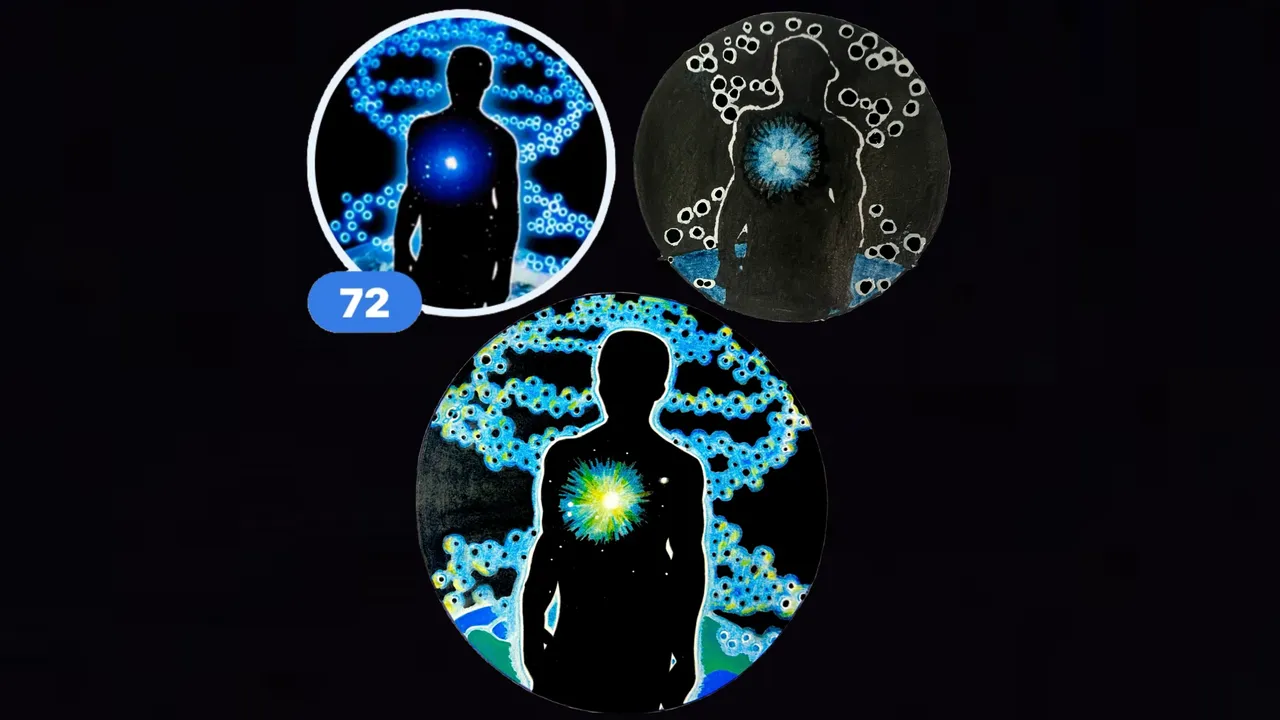
In case D&A were to opt to use one of my hand-drawn avatars, I thought it would be convenient to have sort of the best options tabled up here at the end...so here they are!
| Column 1 | Column 2 |
|---|---|
 |  |
 |  |
 |  |
...all-in-all, this avatar took me between one and two weeks, but it was an incredible journey and learning experience, and has spurred my enthusiasm to make quality hand-made avatars a part of my recurring schedule.
Bonus Content: Two Tickets to Paradise, Eddie Money
Thanks for checking out some more of my work! As always, I hope you enjoyed witnessing as much as I enjoyed creating!
© Photos and words by @albuslucimus, except where otherwise indicated.
If you enjoy my content, check out the Albus Index!
Here you’ll find links to various post-groupings, so you can find all posts related to a specific topic quickly. Topics include lists of brewing recipes, flutes, crypto talks, rucking posts and an index of all acoustic covers. The lists are updated as new content is added, so they can always be used to quickly navigate my content.
source
