Greetings friends of the @Discovery-it community. Since a couple of days ago I saw that OCD had opened a contest to design their logo. I saw that a lot of people participated contributing all kinds of very nice and creative logos. I'm a graphic designer too, so I said to myself "Gabo, give it a try", so I set out to put my design skills to the test.
I made the two logos they requested, one logo for OCD and one logo for POSH, so I will show you each logo in detail and the step by step of each one. I can write a lot about each design, but a picture says more than a thousand words, so this post will be mostly focused on the images, so.... Let's start!
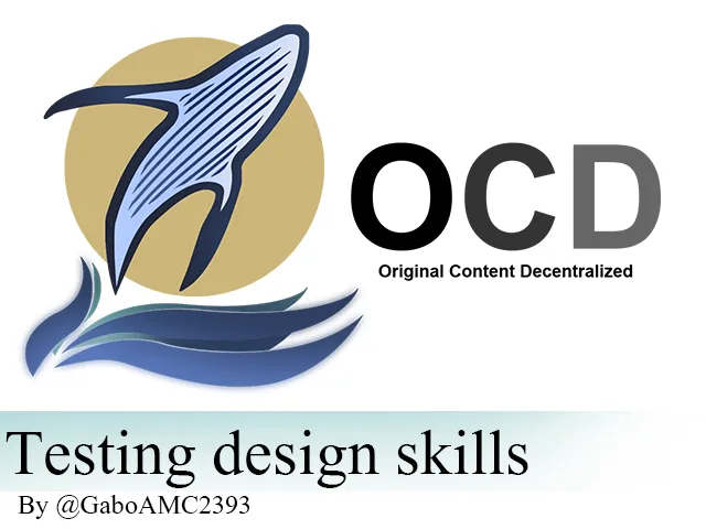
Ok, this is the first logo, the OCD one:
I was inspired by something very impressive that many people don't get the chance to see in their lifetime, a whale jumping out of the water. With this in mind I set out to make the design, something that flowed quickly once I had the idea of how I wanted to capture it. I leave you the step by step of the first logo.


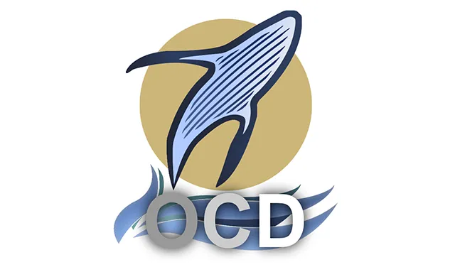
A reduced version for profile image::
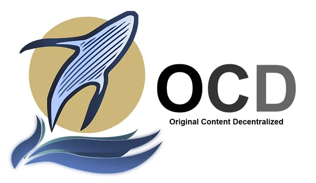
This is how it turned out. A simple logo but pretty decent in my opinion. I also dared to make an animation, but I'll leave it for the end of the post, I hope you like it.
Ok, now let's see the POSH logo. OCD requested a round logo, so this is what I could do:
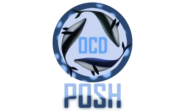
Inspiration wasn't so high at this moment, but being a round logo, it seemed right to design this little whale and create duplicates to place on the edges of the logo, around the words OCD. Finally I wrote the word POSH as the main phrase of the image, being that this was the POSH logo. Here is the step by step below:


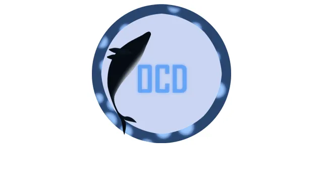


And this is how the image turned out. Simple but also pretty in my opinion. Now, if you read everything I wrote, I imagine you are anxious to see the animation, so I leave it below:

It took me quite a while to make the animation, but I hope you liked the result as much as I did. If you liked the designs of the publication, please leave your opinions below, in the comments. With nothing more to add, I'll say goodbye...
See you next time!
*****Versión en español*****
Saludos amigos de la comunidad Discovery-it. Desde hace un par de días vi que OCD había abierto un concurso para diseñar su logo. Vi que mucha gente participó aportando todo tipo de logos muy bonitos y creativos. Yo soy diseñador gráfico también, así que me dije “Gabo, inténtalo”, así que me dispuse a poner a prueba mis habilidades en diseño.
Hice los dos logos que ellos solicitaron, un logo para OCD y otro logo para POSH, así que les mostraré cada logo en detalle y el paso a paso de cada uno. Puedo escribir mucho sobre cada diseño, pero una imagen dice más que mil palabras, así que esta publicación estará concentrada más que todo en las imágenes, así que... ¡Comencemos!
Bien, este es el primer logo, el de OCD:
Me inspiré en algo muy impresionante que muchas personas no tienen la oportunidad de ver en su vida, una ballena saltando fuera del agua. Con esto en mente me dispuse a hacer el diseño, algo que fluyó rápidamente una vez tuve la idea de cómo quería plasmarlo. Les dejo el paso a paso del primer logo.
Una versión reducida para imagen del perfíl:
Así quedó. Un logo sencillo pero bastante decente en mi opinión. También me atreví a hacer una animación, pero esta la dejaré para el final del post, espero les guste.
Bien, ahora veamos el logo de POSH. OCD solicitó un logo redondo, así que esto fue lo que pude hacer:
La inspiración no estaba tan alta en este momento, pero al ser un logo redondo, me pareció bien diseñar esta pequeña ballena y crear duplicados para colocarlos en los bordes del logo, alrededor de las palabras OCD. Finalmente escribí la palabra POSH como frase principal de la imagen, siendo que este era el logo de POSH. Les dejo el paso a paso a continuación:
Y de esta manera quedó la imagen. Sencilla pero también está bonita en mi opinión. Ahora, si leyeron todo lo que escribí, imagino que están ansiosos por ver la animación, así que la dejo a continuación:
Me llevó bastante hacer la animación, pero espero que les haya gustado el resultado tanto como a mí. Si les gustaron los diseños de la publicación, por favor dejen sus opiniones abajo, en los comentarios. Sin más que agregar, me despido…
¡Hasta la próxima!
Imagenes editadas con Photoshop
Traducido con DeepL
Images edited with Photoshop
Translated with DeepL
Últimos tres post/Last three posts:
My book collection #1 / Mi colección de libros #1
El naufragio del Irasema (Parte I)
Shopping Weekend with mom / Fin de semana de compras con mi mamá